
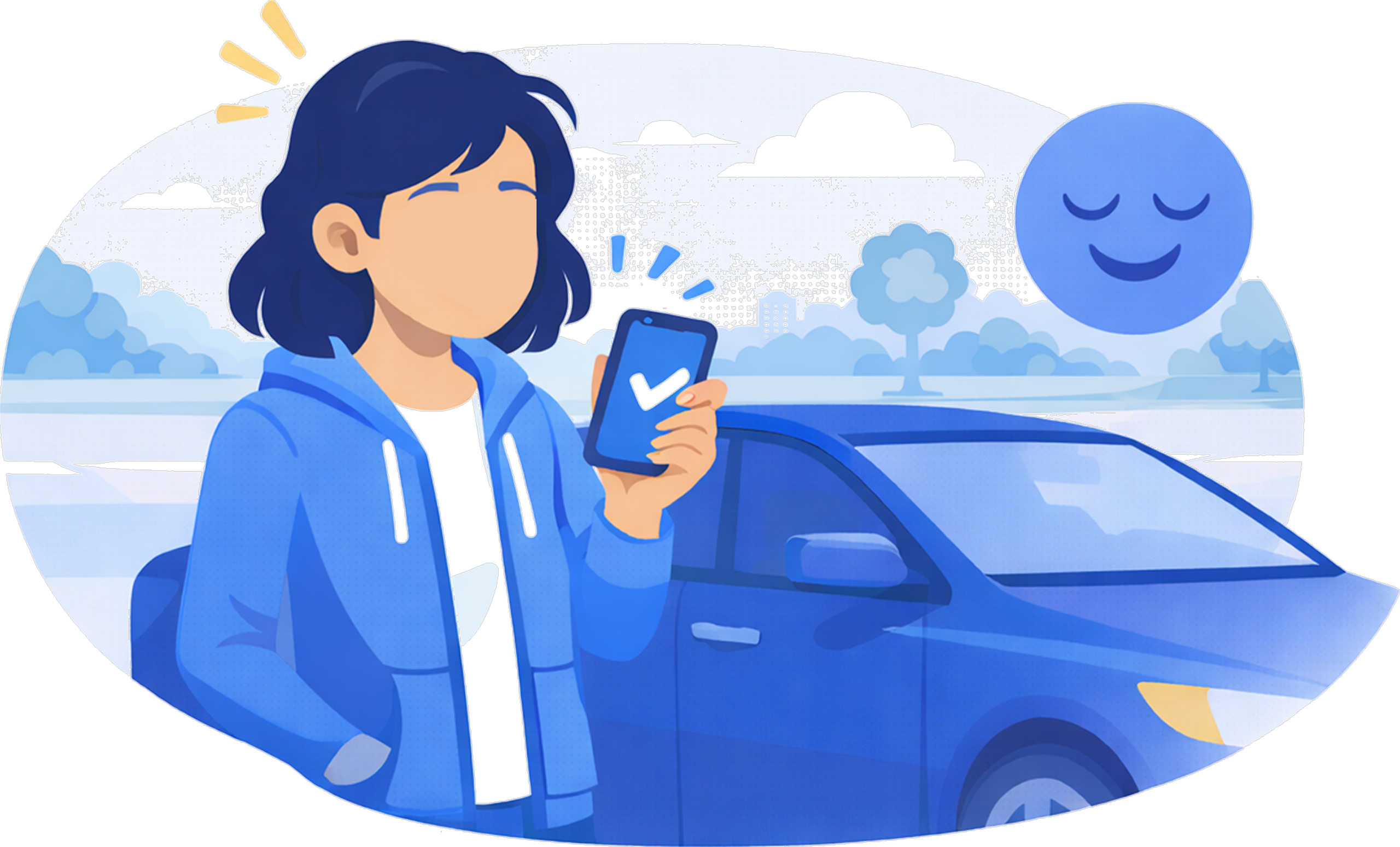
Fuel with PayPal
Role
Lead UX Designer
Platform
iOS / Android
Timeline
Multi-quarter Initiative 2021-22
Team
Product, Engineering, Content, Research, Risk / Legal
Overview
Paying for gas is a universal task, yet it often comes with unnecessary friction-lines, unclear instructions, and outdated hardware experiences.
I led UX design for PayPal’s Pay at Pump experience, enabling customers to find and pay directly from their phone with minimal effort. The goal was to create a fast, intuitive, and trustworthy flow that worked across different gas stations while navigating gas station's evercomples third-party systems. "It should work like magic".
Key Outcomes
- Successful payment completion rates
- Reduced time spent at the pump
- Increased user confidence in mobile fueling
- Established a scalable UX framework for future station partners (more on this later)
50%
80%
6k
1/wk
Overall Conversion
Pump activation rate
Monthly Active Users
Transactions Per Account
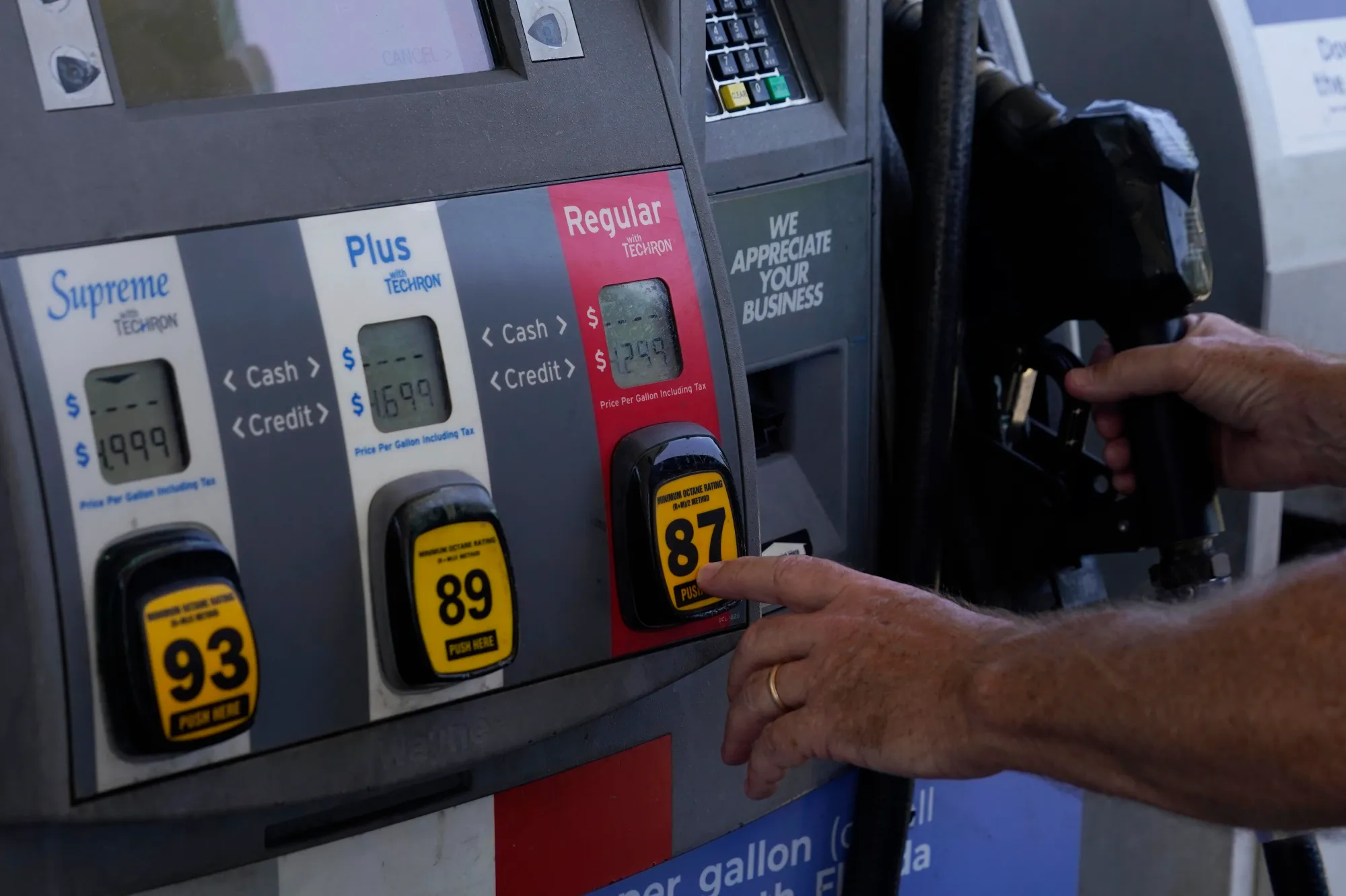
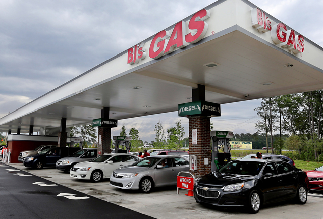
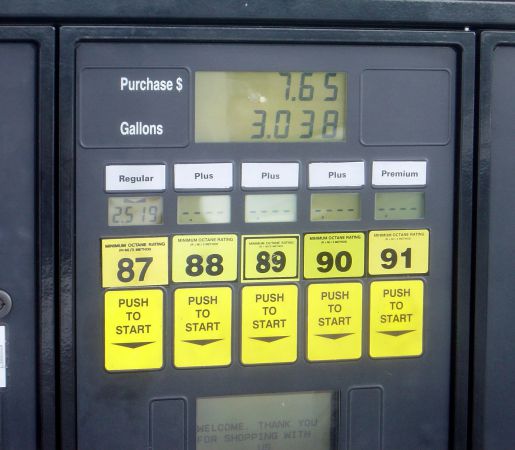
The Problem
Traditional gas payments rely on:
- Physical card readers
- Confusing on-screen prompts
- Inconsistent station hardware
- Physical touch on high-traffic surfaces
Users wanted:
- Confidence their payment was secure
- Clear instructions to get in and get out ASAP
- Reduce amount spent on station hardware
But the bigger challenge wasn't just the technology - it was the environment.
Gas stations and checkout lines are public, time-sensitive spaces where users feel pressure to move quickly and not inconvenience others, Even small moments of confusion can be amplified.
From a business perspective, PayPal needed a solution that worked across multiple fuel partners, met strict legal and risk requirements (PayPal x 3rd-party fuel merchnats), and was easy to adopt by users AND merchants.
Design Challenge
After discussing logistics with PMs, we were ready to begin establishing some foundations for the project.
01
Establish Entry Points
Determine the most intuitive and discoverable entry points within the PayPal app, making the new feature easy for users to find and access.
02
Onboard & Educate New Users
Design an onboarding experience that clearly educates users on how to use the new feature, ensuring quick understanding and confident adoption.
03
Convenient Station Locating & Payment
Design an experience that lets users quickly identify their exact gas station or nearby options and pay through PayPal with minimal effort—removing friction and making fueling feel fast, simple, and ‘magical.’
How might we:
"design a PayPal experience that lets customers easily find and pay for gas with as little effort as possible?"
My Role & Responsibilities
Research & Key Insights
To better understand how users behave in busy, real-world environments, we conducted mixed-method research focused on customers who frequently drive, rely on gas stations, and spend a significant amount of time running errands outside the home.
These users often interact with apps in public, time-pressured situations—such as gas stations or checkout lines—where distractions are high and tolerance for friction is low.
What We Learned
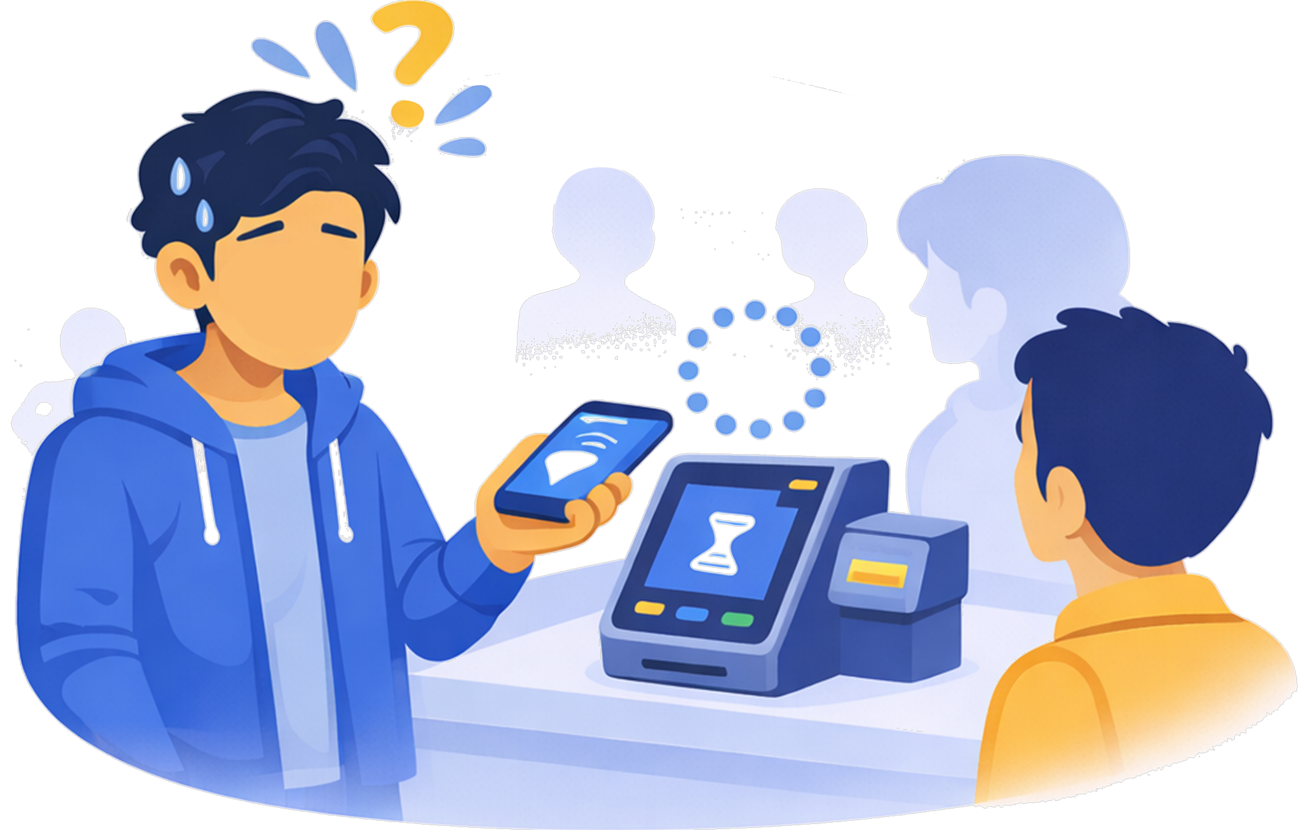
Public environments increase pressure and hesitation
- ~70% of participants said they felt pressure to “move quickly” when shopping in-person
- Even minor uncertainty caused hesitation or abandonment
- Users were far less willing to “explore” or troubleshoot in these moments
Implication: The experience had to be immediately understandable with no learning curve.
Lower cognitive load improves speed and confidence
- The less information presented at a time, the faster the completion rates
- Users reacted negatively to visual clutter choices
- When users understood what to do at a glance they moved forward without hesitation
Implication: The design needed to always prioritize one next best action at a time (i,e; "chunking").
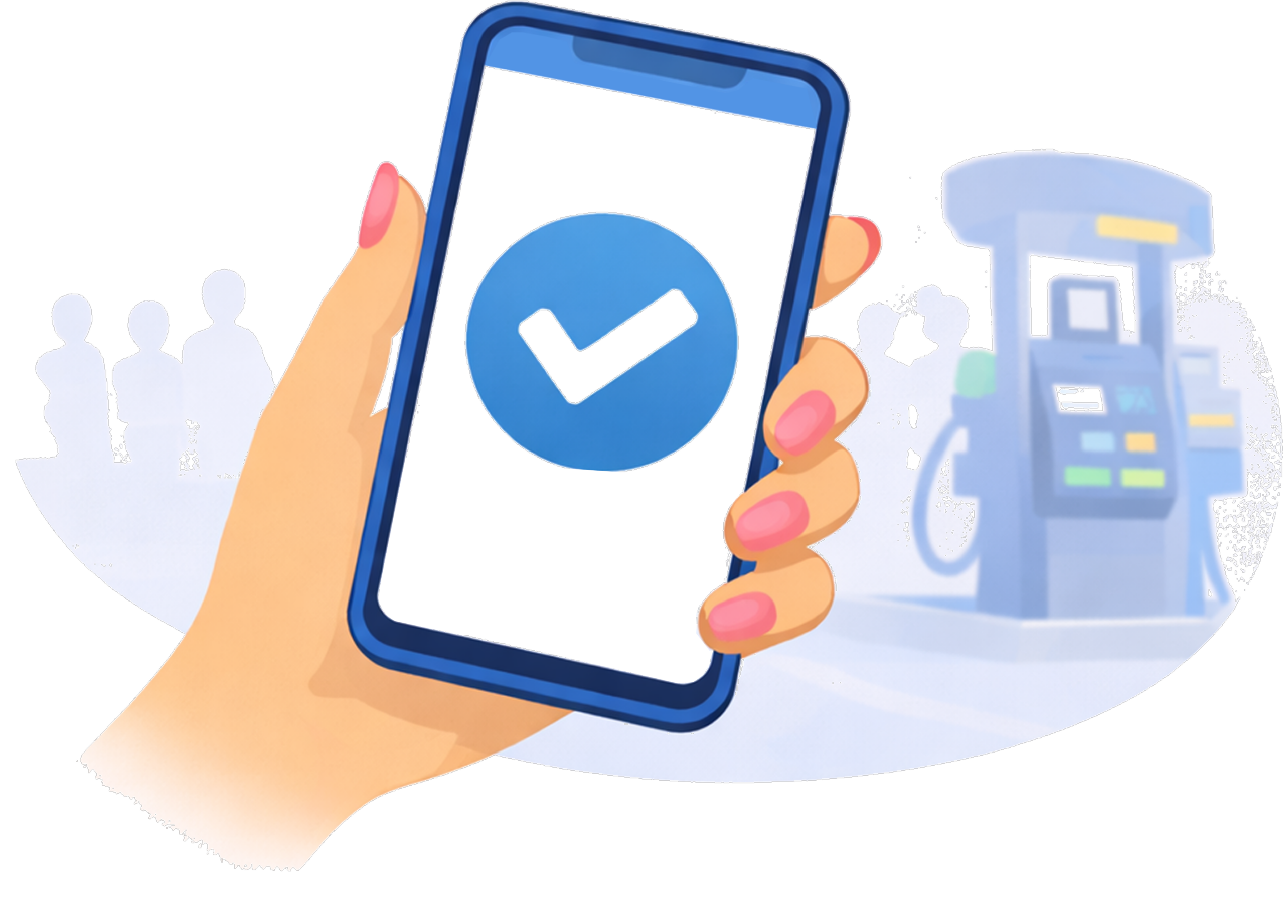
Clear explanations and visual confirmation build trust
- Over 60% of participants said visual confirmation (e.g., pump identification, location cues) made them feel more confident
- Lack of confirmation increased fear of selecting the wrong pump or paying incorrectly
- BONUS: Users were happy and felt safer knowing they could now pay with PayPal
Implication: Visual and language clarity was as important as functional accuracy.
Design Work
Once we had enough insights to guide a solution, we began crafting our three primary flows:
1. Setup & Onboarding
This flow was designed to be fast, lightweight, and low-effort, so users could complete setup either at home or during their first visit to a gas station. To reduce cognitive overload in public environments, the experience was intentionally minimal and easy to scan.
Key Decisions
- Two-step setup: enable location services and confirm a default payment method
- Location required upfront: powers nearby station discovery and geofencing
- Short copy, minimal visuals: optimized for quick scanning in public
- No heavy onboarding: no heavy interactions or long explanations
- Immediate payoff: users land directly on list of nearby gas stations
2. Finding a Gas Station
This flow focused on helping users quickly find and navigate to nearby gas stations, while reducing manual steps once they arrive. By leveraging location data and geofencing, the experience feels automatic and seamless, setting users up to begin paying at the pump with minimal friction.
Key Decisions
- “Near me” station list: stations are ordered by proximity for fast decision-making
- Quick navigation access: one tap to open directions via Google Maps or Apple Maps
- Optional station details: users can preview perks before heading out
- Automatic station context on arrival: the correct station page loads instantly, without user input (thanks to geofencing)
3. Paying at the Pump
This flow focused on supporting users through a physical, multi-step interaction between their phone and the gas pump. Because users are navigating a real-world environment with multiple distractions, each step in the app was designed to be clear, lightweight, and focused on one to two simple actions at a time.
Key Decisions
- One task per screen: reduced cognitive load in a physical, high-distraction environment
- Intentional step granularity: favored short, focused steps over dense screens
- Motion as feedback: used animations to signal progress during lenghty pump connections
- Includement of third-party services: optional car wash and loyalty program
Post-launch Results
The first Pay at Pump launch (August 2022) showed strong early traction, validating our approach to minimizing cognitive load and relying on location-aware automation in a public, high-distraction environment.
50%
$56
84%
~4k
Overall Conversion
Average order value (AOV)
Users enabling locating sharing
Transactions per week
Engagement & Discovery
- Contextual Dashboard placement drove the highest engagement, outperforming secondary entry points.
- Entry-point CTR remained stable (~6.8–7%) as volume increased, indicating sustained discoverability rather than novelty-driven usage.
Adoption & Usage
- Weekly transaction volume scaled quickly following launch, reaching ~4K transactions per week.
- The PayPal app emerged as a primary surface for in-person payments, contributing roughly half of all Pay at Pump transactions.
- Repeat usage increased over time, signaling growing user confidence in the experience
Trust & In-Person Behavior
- A high location opt-in rate (84%) enabled reliable geofencing and automatic station detection on arrival.
- Stable AOV (~$56) suggested users were comfortable completing full, real-world fuel purchases without hesitation.
- Funnel data showed successful progression through authorization and fueling states, with minimal drop-off once users reached the pump.
Outcomes & Key Learnings
The final outcome was more than a new payment flow. It was a redefinition of how PayPal could operate in a real-world, high-pressure environment.
The experience transformed a traditionally confusing, hardware-dependent interaction into a simple, mobile-first flow. By reducing cognitive load and leveraging location-aware automation, users were able to move through the experience quickly and with confidence. Completion rates improved, hesitation decreased, and the overall interaction felt more seamless and intuitive.
The biggest challenge was designing for a context we couldn’t fully control. Unlike typical in-app experiences, this flow depended on physical environments, third-party systems, and real-time conditions. Balancing simplicity with reliability—while ensuring users always felt in control—required careful prioritization and constant iteration.
If I were to approach it again, I would invest even earlier in stress-testing edge cases with real-world conditions and partner systems. This would help uncover points of uncertainty sooner and further strengthen the resilience of the experience.
This project reinforced a key principle in my design philosophy: in moments of urgency, simplicity is not a luxury—it is essential. When users are navigating real-world tasks, clarity and confidence define the experience.

Interested in working together?
Designed and built by Alejandro Garzon. © 2026 All rights reserved.