
Transformimg PayPal’s Financial Front Door
Role
Lead UX Designer
Platform
iOS / Android
Timeline
Multi-quarter Initiative 2024-25
Team
Product, Engineering, Content, Research, Risk / Legal
Overview
PayPal’s Home screen is the entry point to nearly every action within the product ecosystem—sending money, managing cards, checking balances, and discovering financial tools. Over time, however, the surface had accumulated features that competed for attention, making it harder for users to quickly understand what mattered most.
I led UX design for the redesign of the PayPal Home experience, helping transform it from a cluttered dashboard into a structured financial front door. The goal was to create a clearer, more scalable system that could highlight everyday spending and rewards—particularly the PayPal Debit Card, which offered users 5% cashback on purchases. By restructuring hierarchy and surfacing rewards more intentionally, the experience aimed to make spending through PayPal feel simple, rewarding, and immediately understandable.
Key Outcomes
- Increased visibility and engagement with the PayPal Debit Card experience
- Improved product discovery across the Home surface
- Reduced decision friction through clearer visual hierarchy
- Strengthened daily spending behavior through cashback incentives
- Established a scalable Home framework for future product launches
+18%
+12%
+22%
+2.3x
Debit Card engagement
Home surface product discovery
Task completion from Home surface
Debit Card awareness
Empathize
Discovery & Research
Before moving a single component, I needed to understand what the home experience had become and what it needed to evolve into.
The existing home surface had gradually accumulated features. Over time, cards were added, resized, and rearranged. While each addition made sense in isolation, the cumulative effect was clutter. There was limited visual hierarchy. Hero areas did not clearly showcase priority products. The UI lacked refinement, and key offerings were visually competing rather than leading.
At the same time, PayPal was launching the debit card under the broader “PayPal Anywhere” narrative. From a business perspective, this was about expanding daily usage and driving card adoption. From a customer perspective, it was about rewards, cashback, gamification, and feeling empowered in everyday spending.
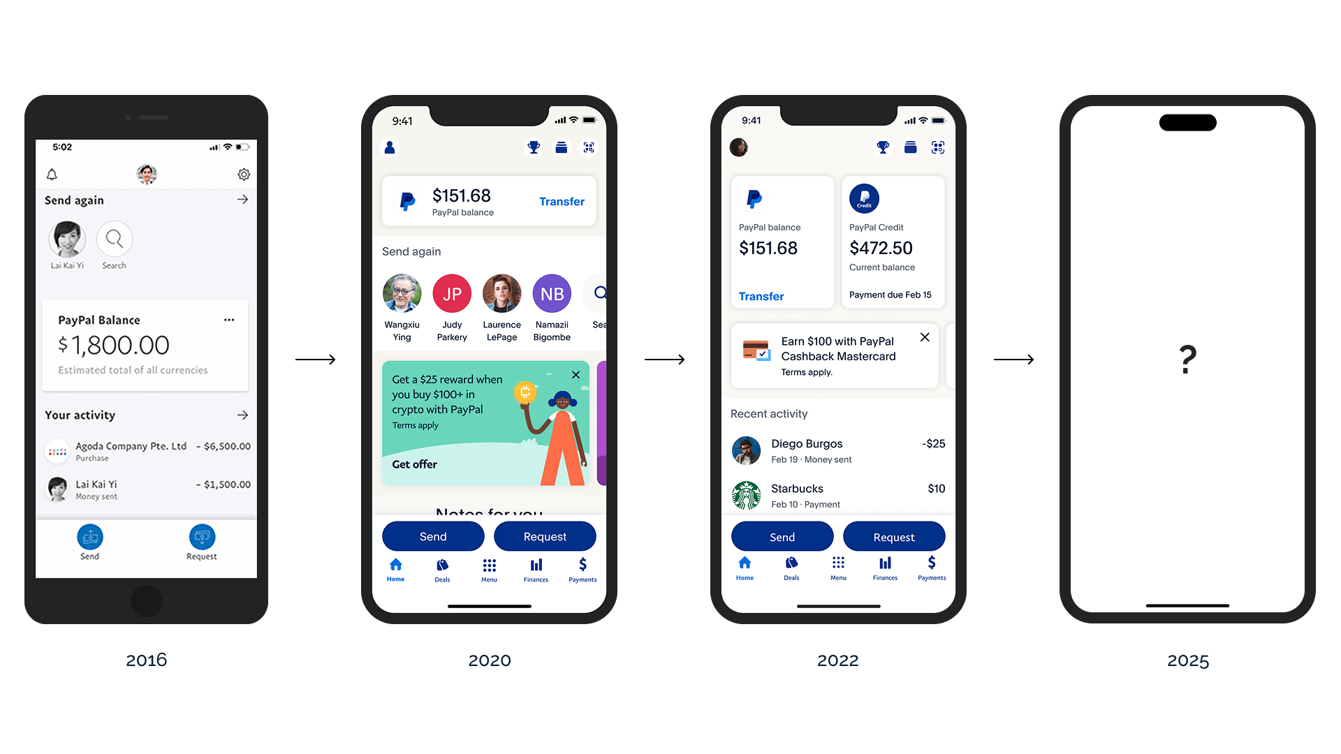
Research Inputs & Validation
Multiple research streams informed the redesign:
- Large-scale industry studies conducted internally gave us a macro view of fintech behavior patterns.
- We collaborated with an external design agency focused on component-level UI improvements.
- A dedicated research lab team hired by PayPal provided structured testing insights.
- We ran A/B experiments to validate placement, hierarchy, and engagement strategies.
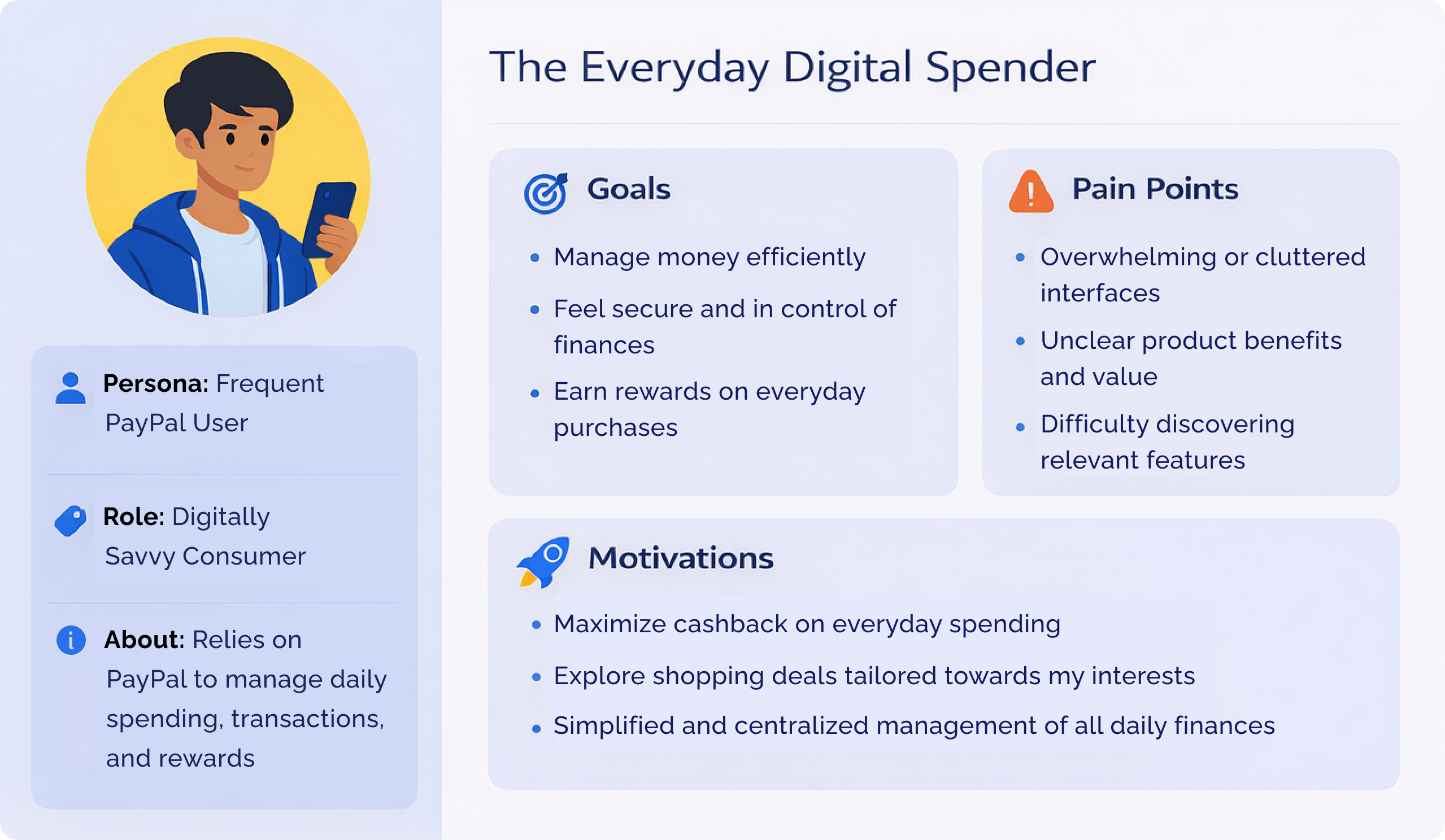
My role was to synthesize these inputs and translate them into a cohesive product direction for the home ecosystem. Key insights that shaped my thinking:
- Users did not fully understand the breadth of PayPal’s product ecosystem.
- High-value products were not visually distinguished enough.
- Clutter reduced scannability and delayed decision-making.
- Gamification mechanics such as tiers and rewards had strong motivational potential, but they needed to be implemented carefully to preserve trust.
- Validation did not rely on intuition. Every direction we pursued was grounded in behavioral data, A/B results, and alignment sessions with product and analytics teams.
Insights to Personas
Define
Clarifying the Real Problem
Once research was synthesized, the real challenge became clearer. This was not about inserting a debit card module into the home screen. It was about restructuring the home ecosystem so that it could:
- Elevate priority products like the PayPal debit card and tailored merchant offers/products
- Introduce gamification without compromising trust
- Improve hierarchy and reduce cognitive overload
- Maintain compliance across third-party systems
- Respect brand immutability and system constraints
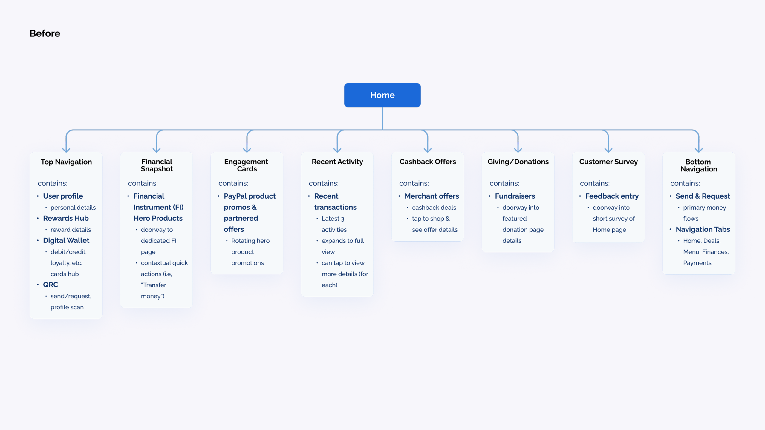
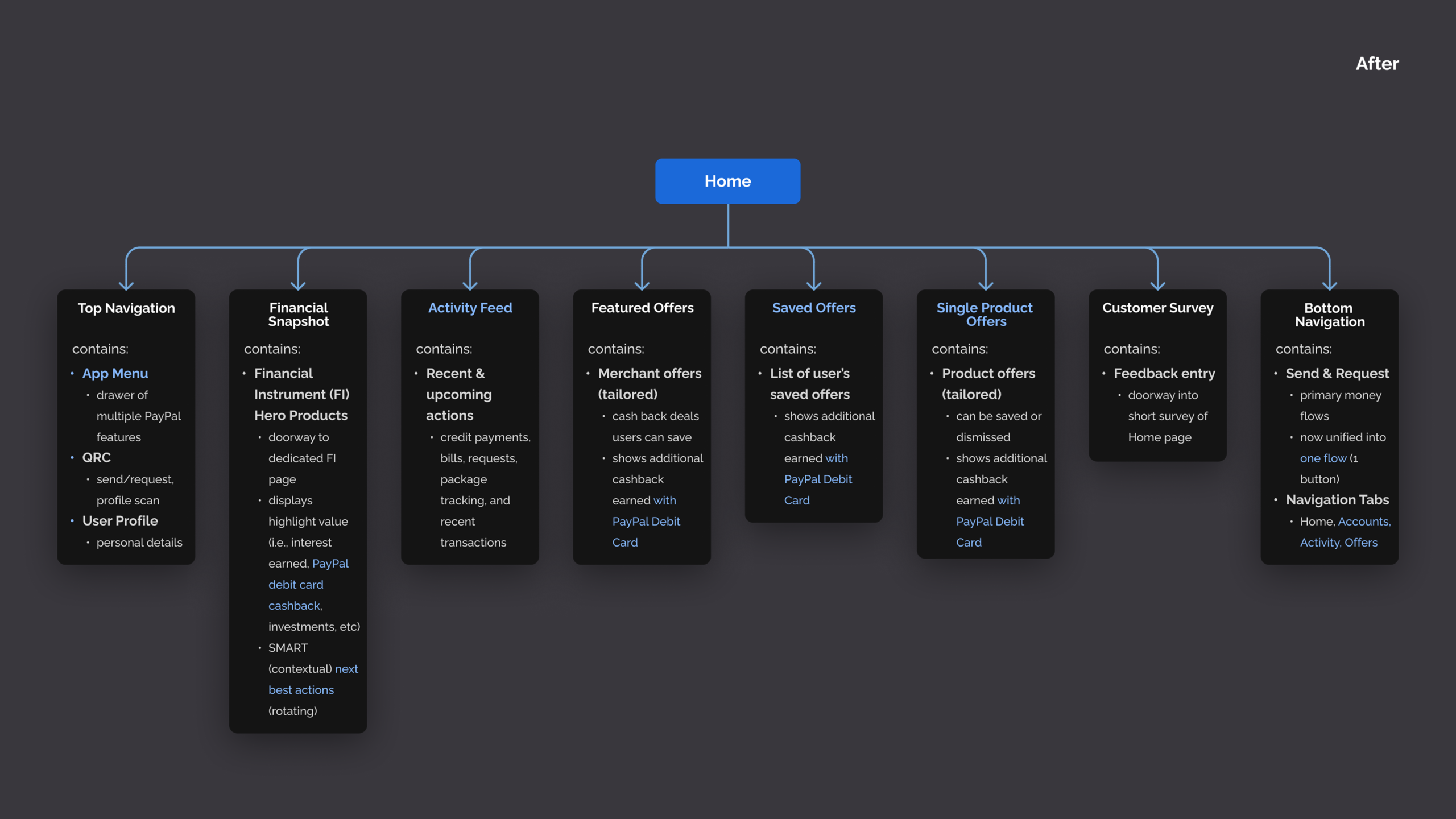
I translated research into UX goals by consolidating insights into structured Confluence documentation. This included hierarchy studies, behavioral findings, and design principles that guided decision-making.
The guiding/design principles we aligned on were:
- Uniformity across surfaces
- Clear and intentional visual hierarchy
- Hero-driven product storytelling
- Scalable component systems
Prioritization was driven by impact. The debit card and reward tiers became hero-level experiences. Supporting functionality was reorganized beneath them in a more coherent information architecture.
How might we:
"transform the PayPal home into a clear financial front door that naturally drives debit card usage and cashback engagement?"
Ideate / Concepts
Defining the Financial Front Door
During ideation, I reframed the home surface from a transaction dashboard into a product narrative space.
I explored three core concept directions:
01
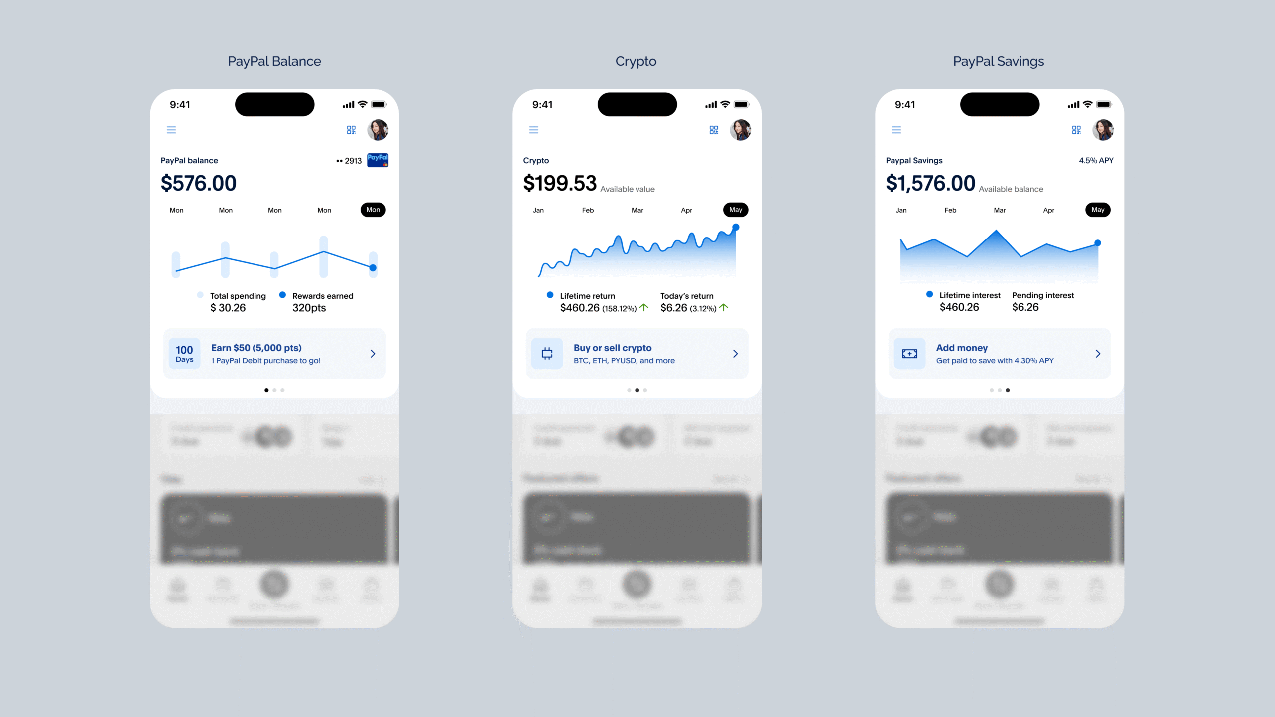
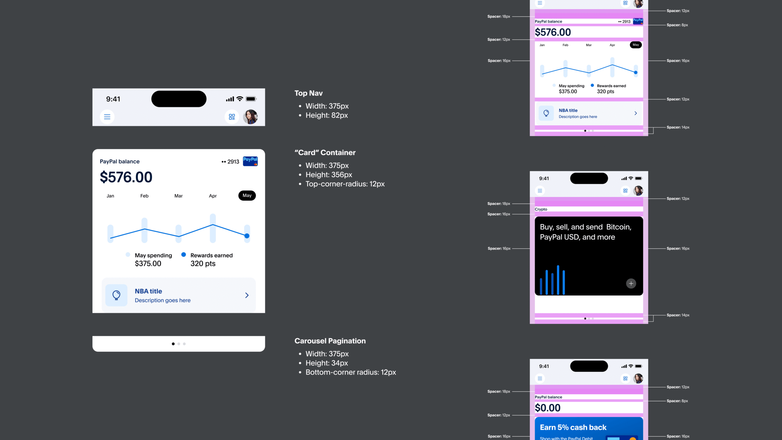
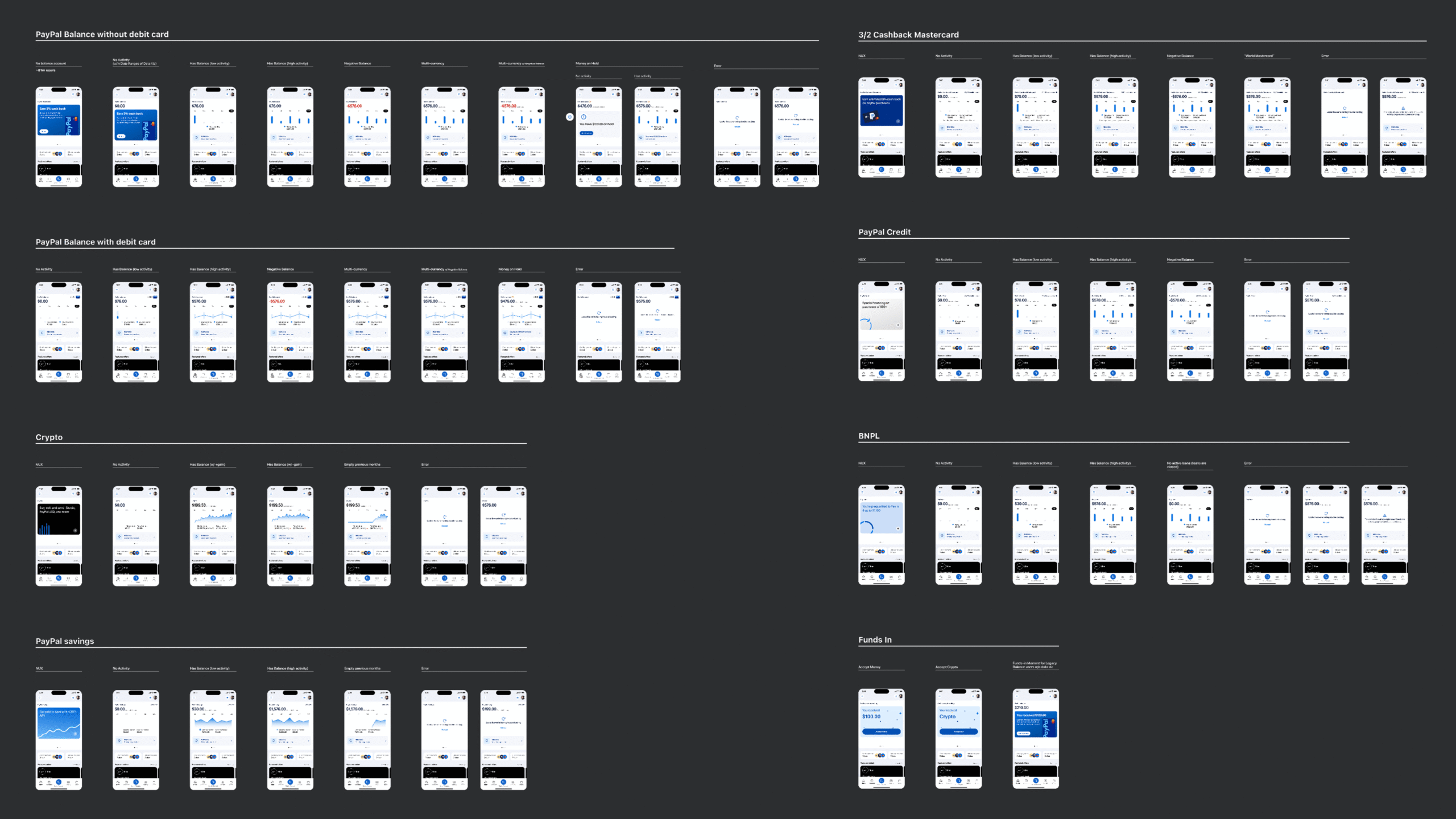
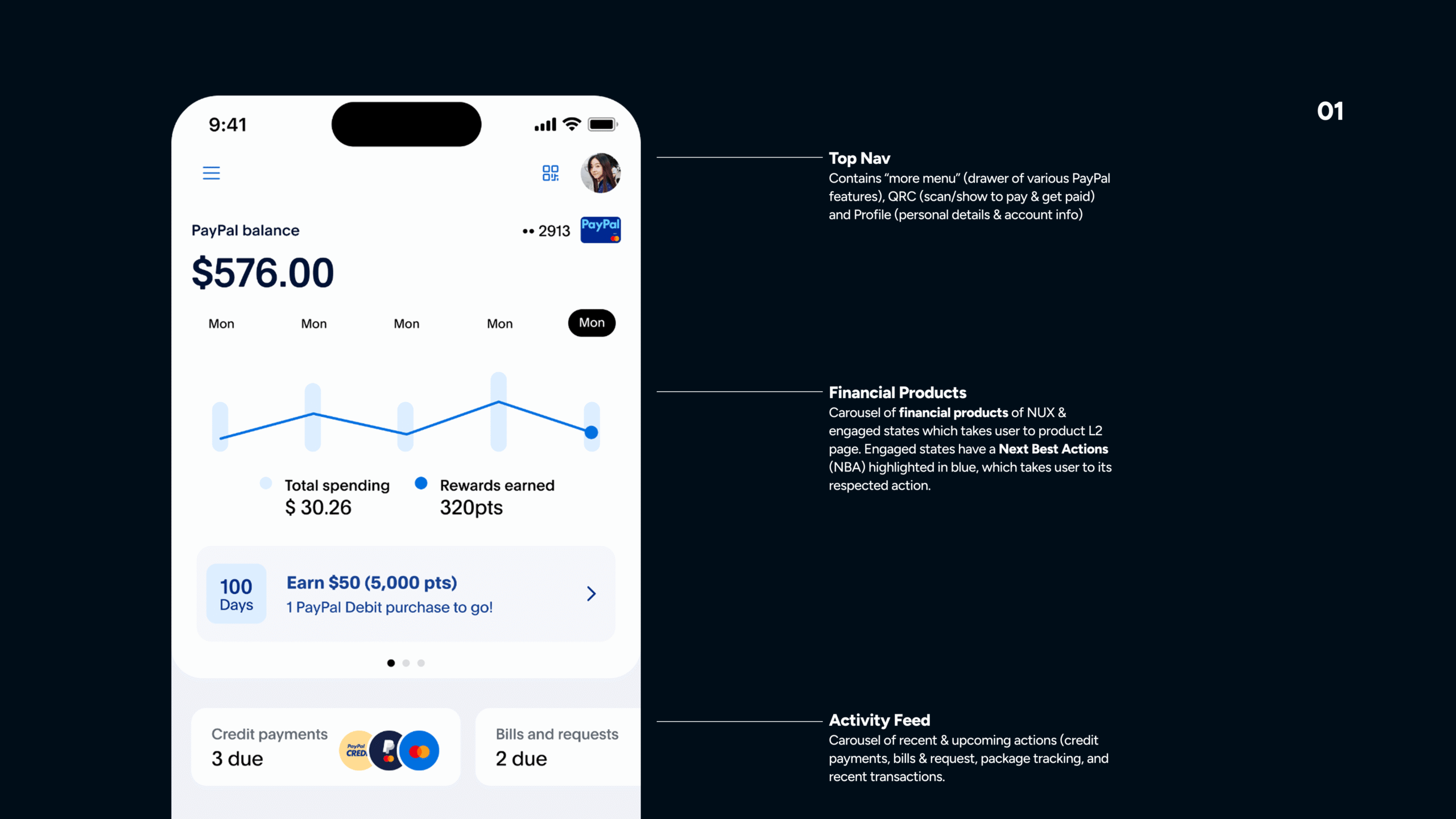
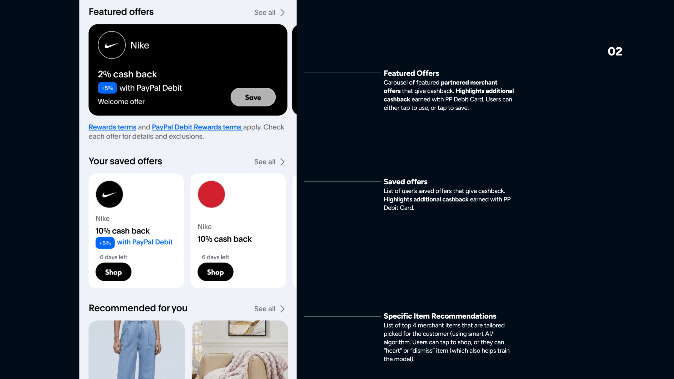
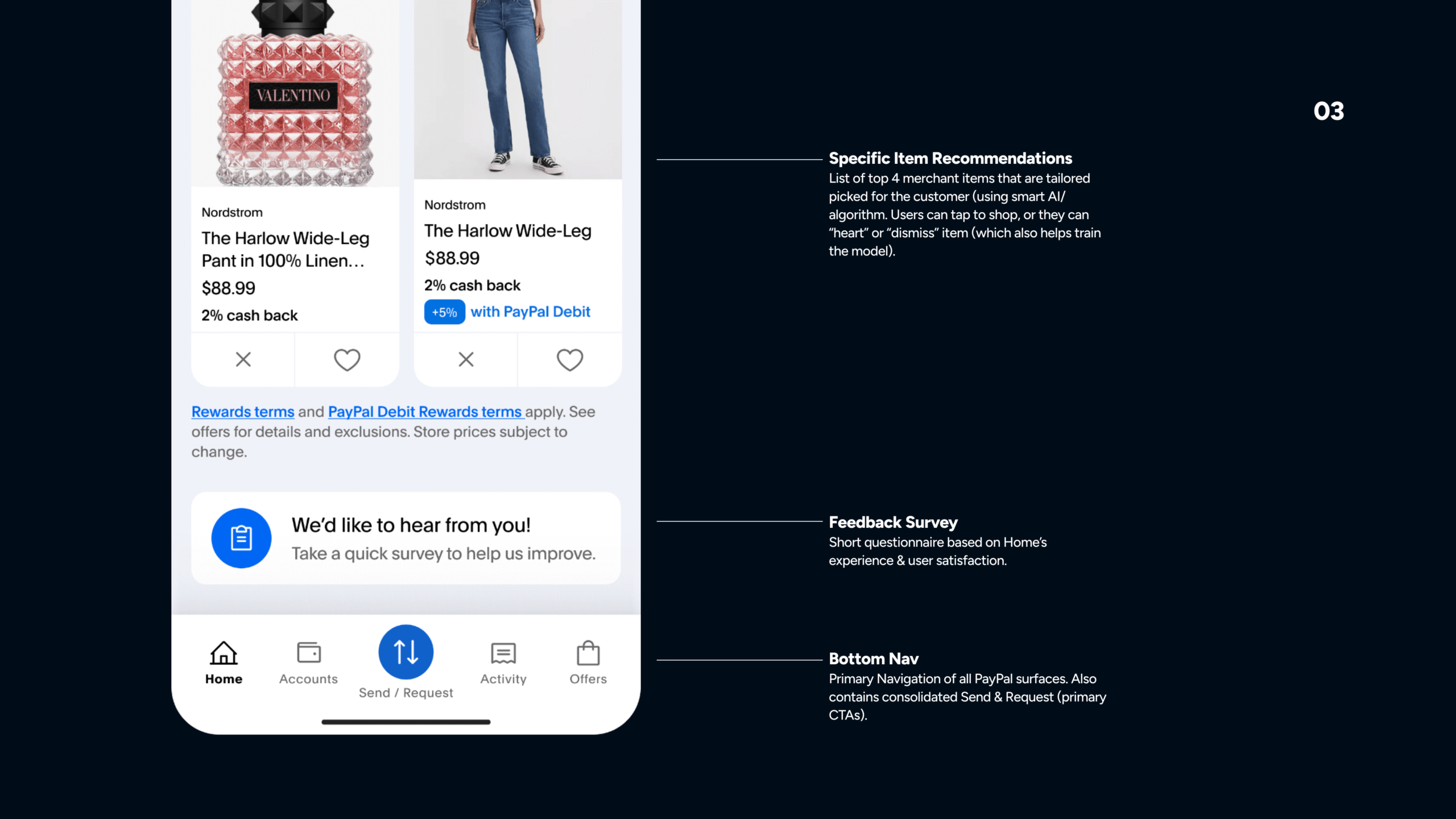
A modular hero system that could dynamically prioritize key products such as the debit card.
02
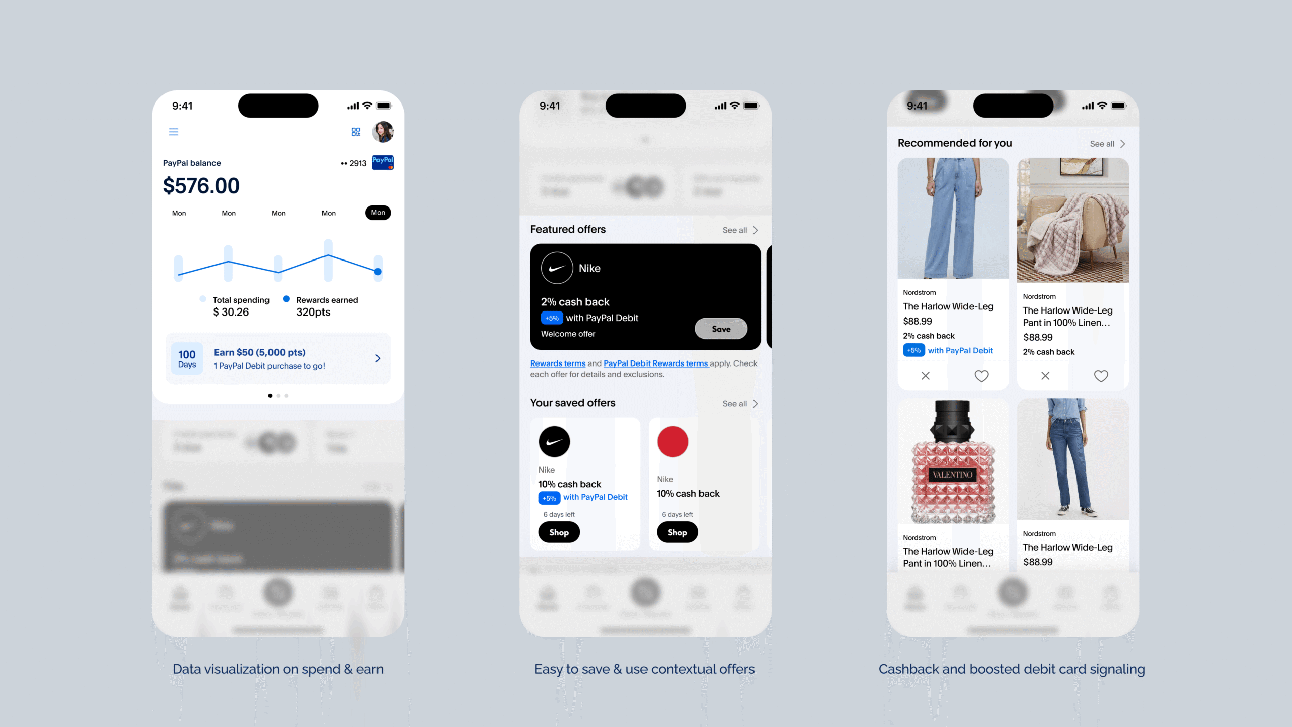
Embedded gamification elements, including tier badges and reward progress indicators integrated directly into the home surface rather than isolated elsewhere.
03
A refined visual system that reduced card sizes where necessary, introduced clearer spacing, and improved typographic hierarchy.
Testing Our Hypothesis
Proving the Impact
Testing was iterative and data-driven. We ran structured A/B tests evaluating:
- Hero module prominence
- Copy variations for rewards messaging
- Card sizing and density
- Tier visibility intensity
Metrics tracked included:
- Conversion uplift
- Drop-off reduction
- Time on task
- Error rate changes
Results demonstrated improved product visibility and stronger engagement. Clearer hierarchy reduced friction and improved task efficiency. The debit card gained stronger awareness through hero positioning.
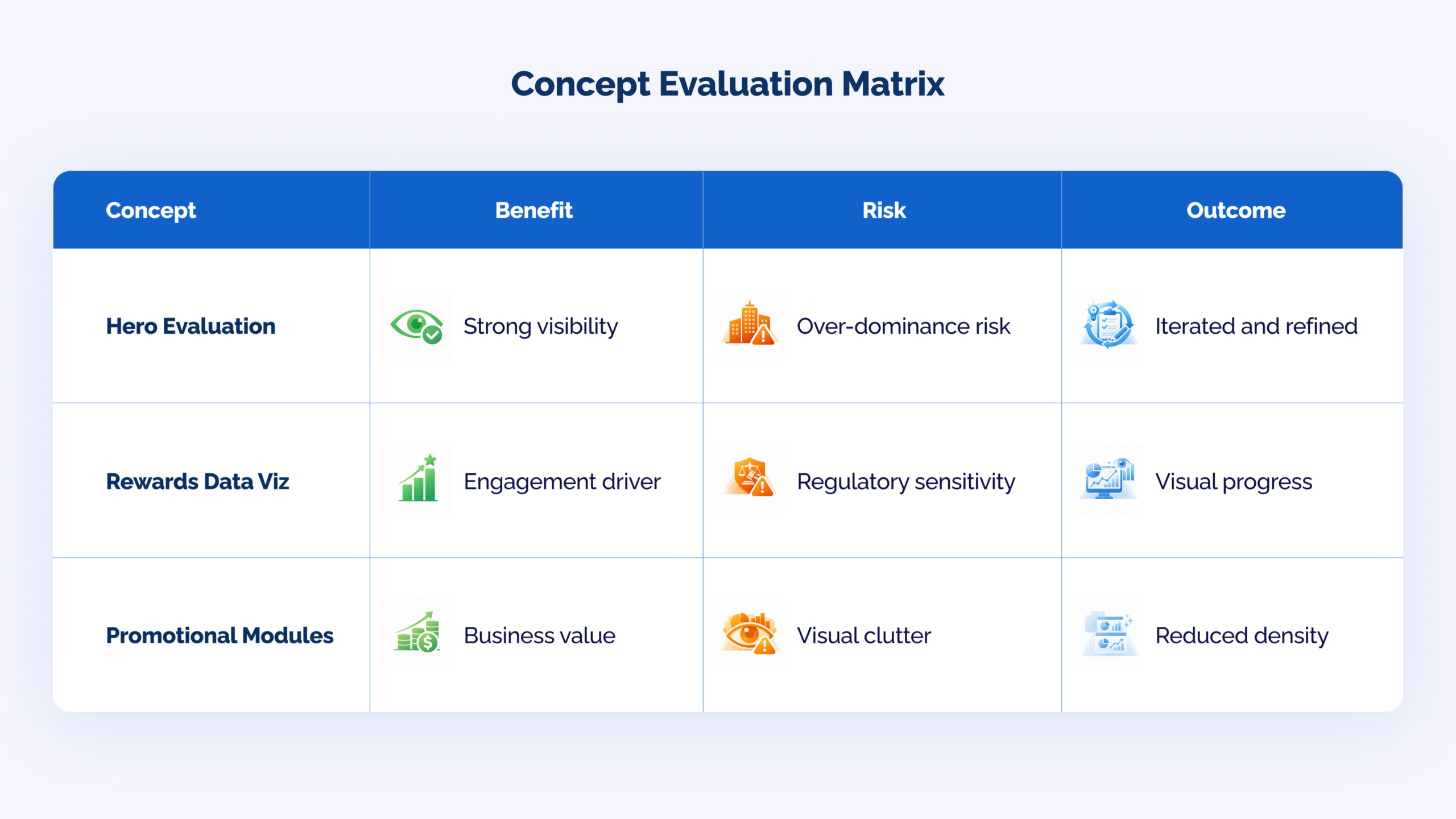
Qualitative usability sessions reinforced quantitative results. Users described the new experience as clearer, more modern, and easier to navigate, which aligned with our original concept evaluation matrix.
Constraints
Rewards Pipeline & Engineering Efforts
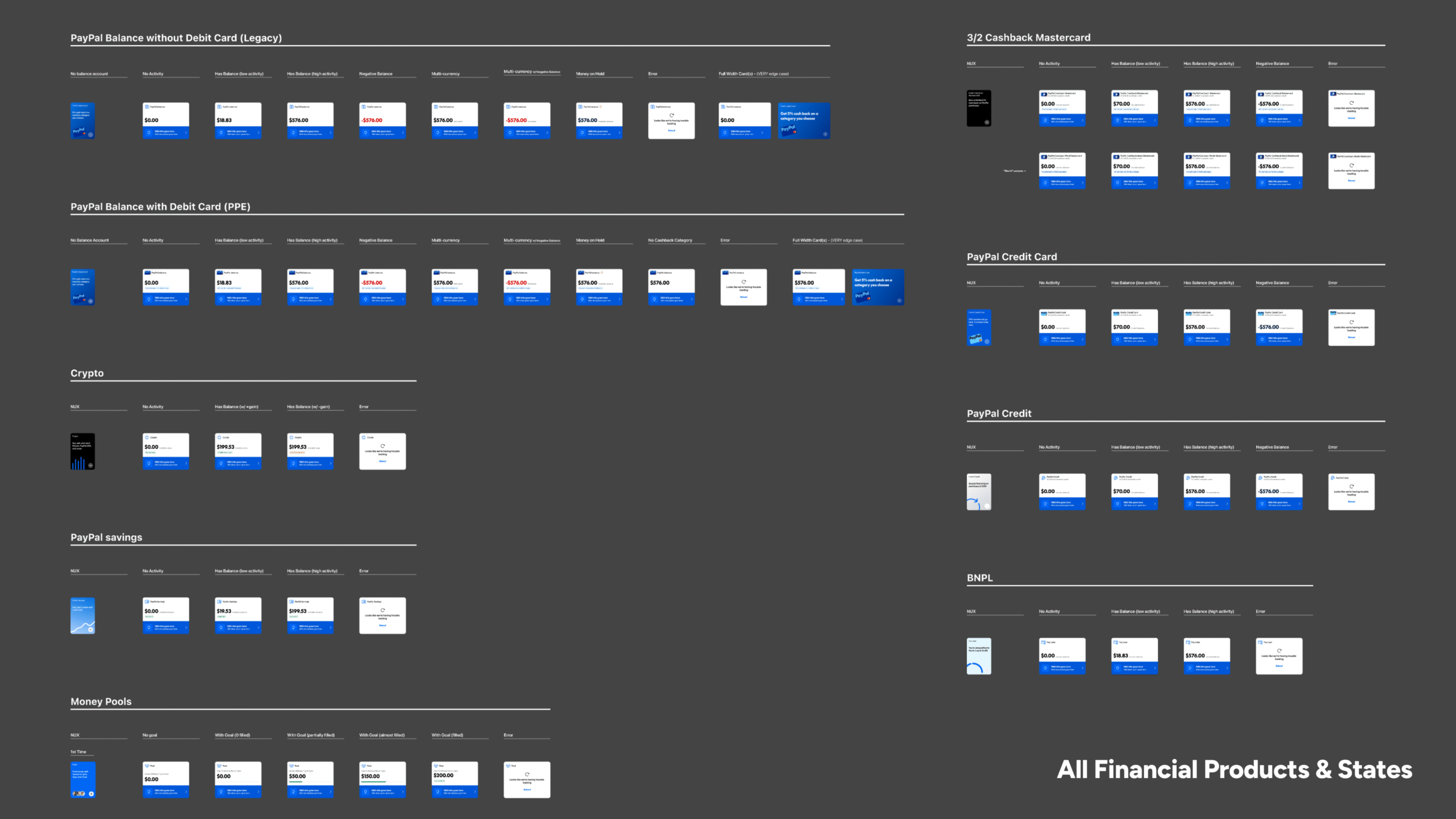
As we finalized leadership-approved designs, engineering flagged that the scope for delivering data visualizations—specifically spend and earn progress—had been significantly underestimated. Given the strategic importance of this launch, delaying the release was not an option. We needed to quickly pivot and redesign the financial snapshot without data visualizations.
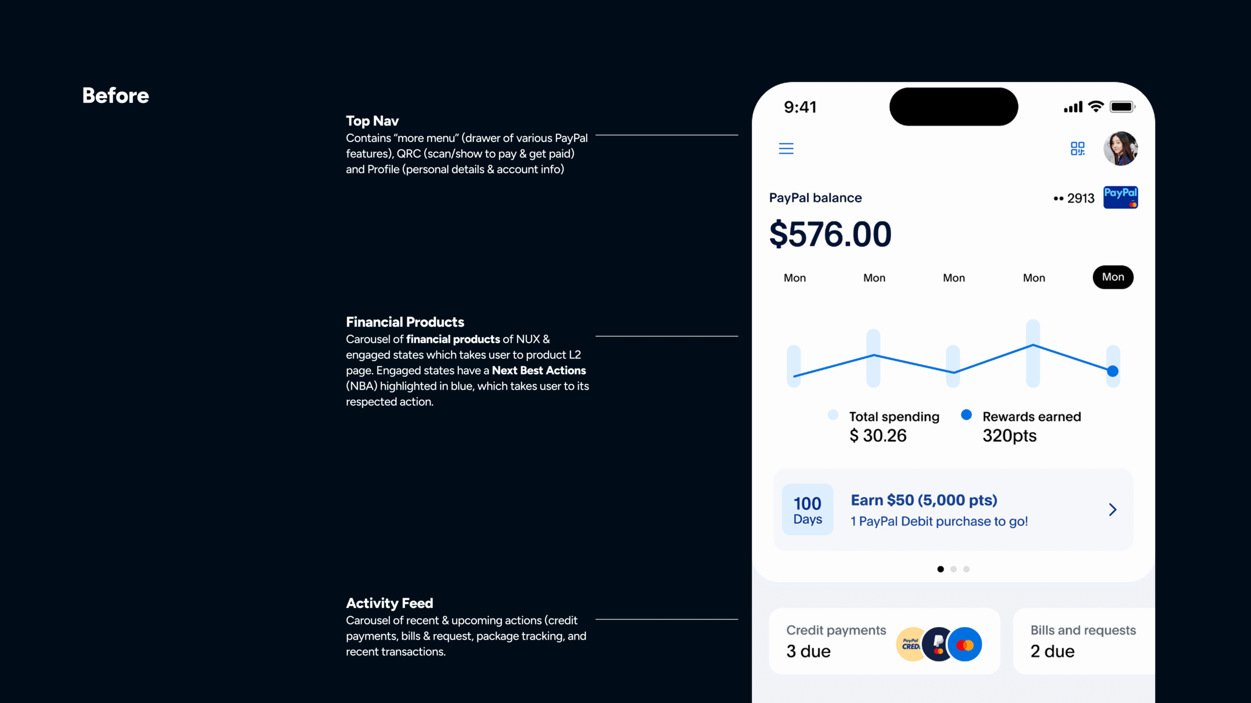
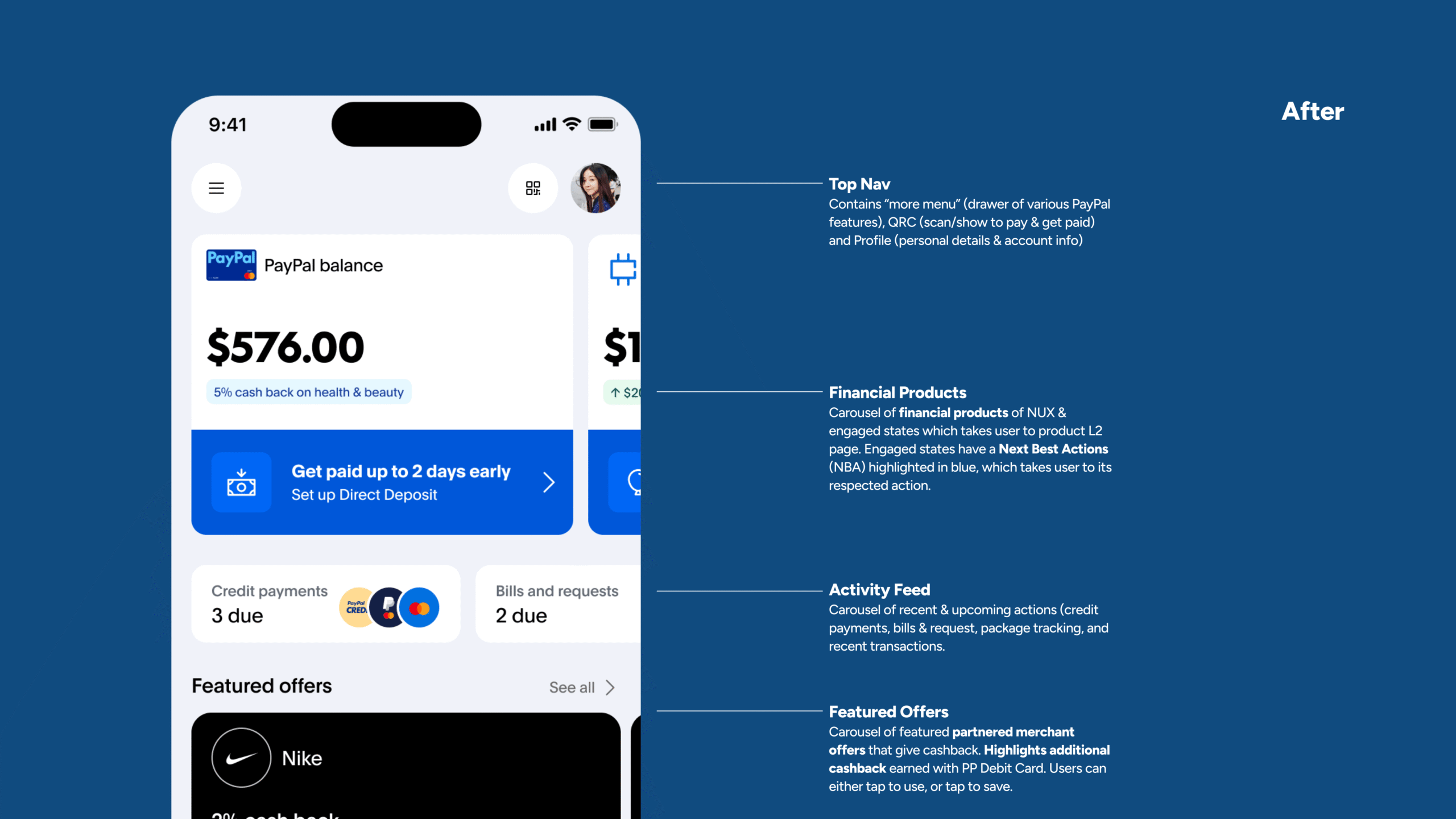
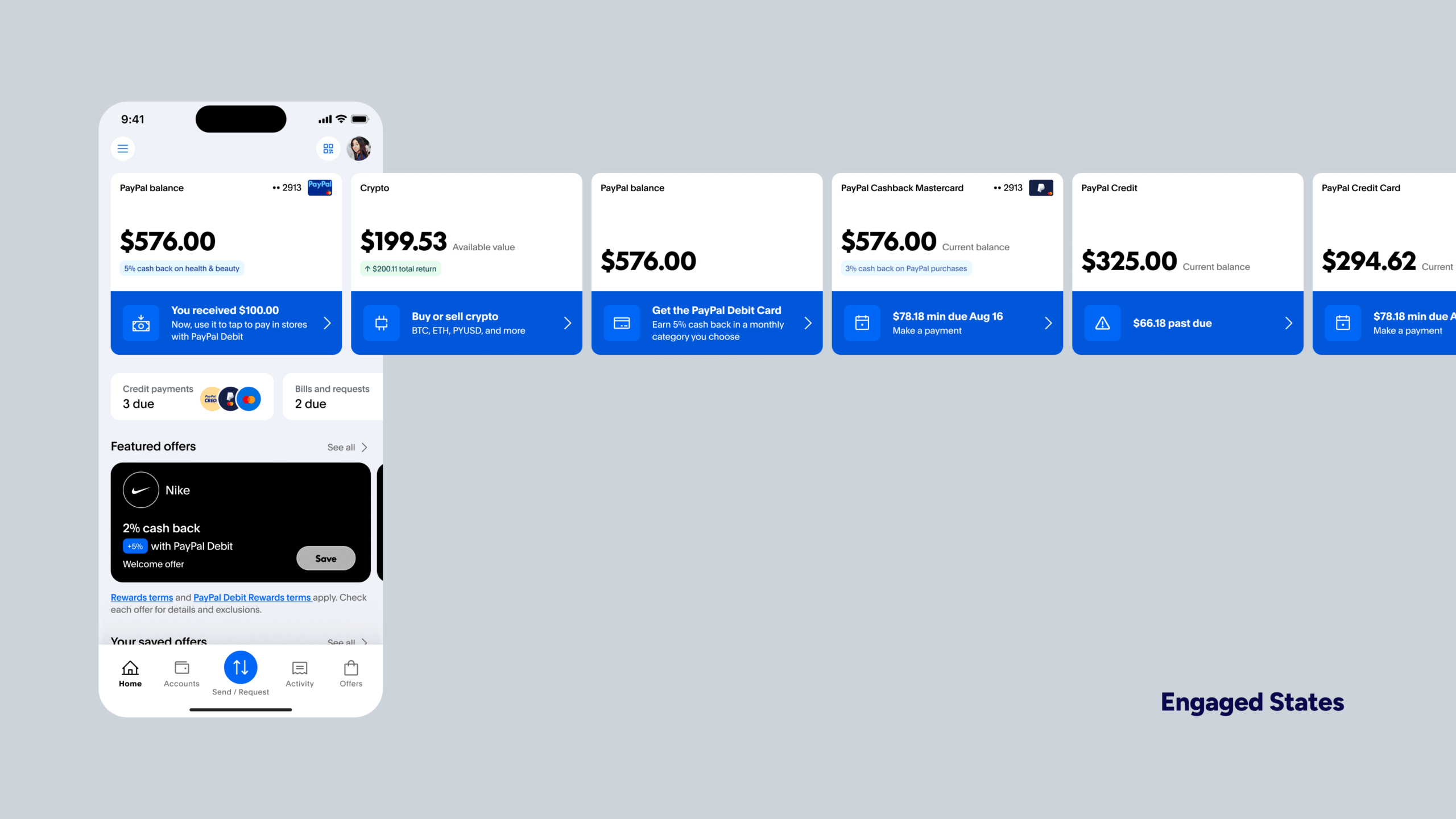
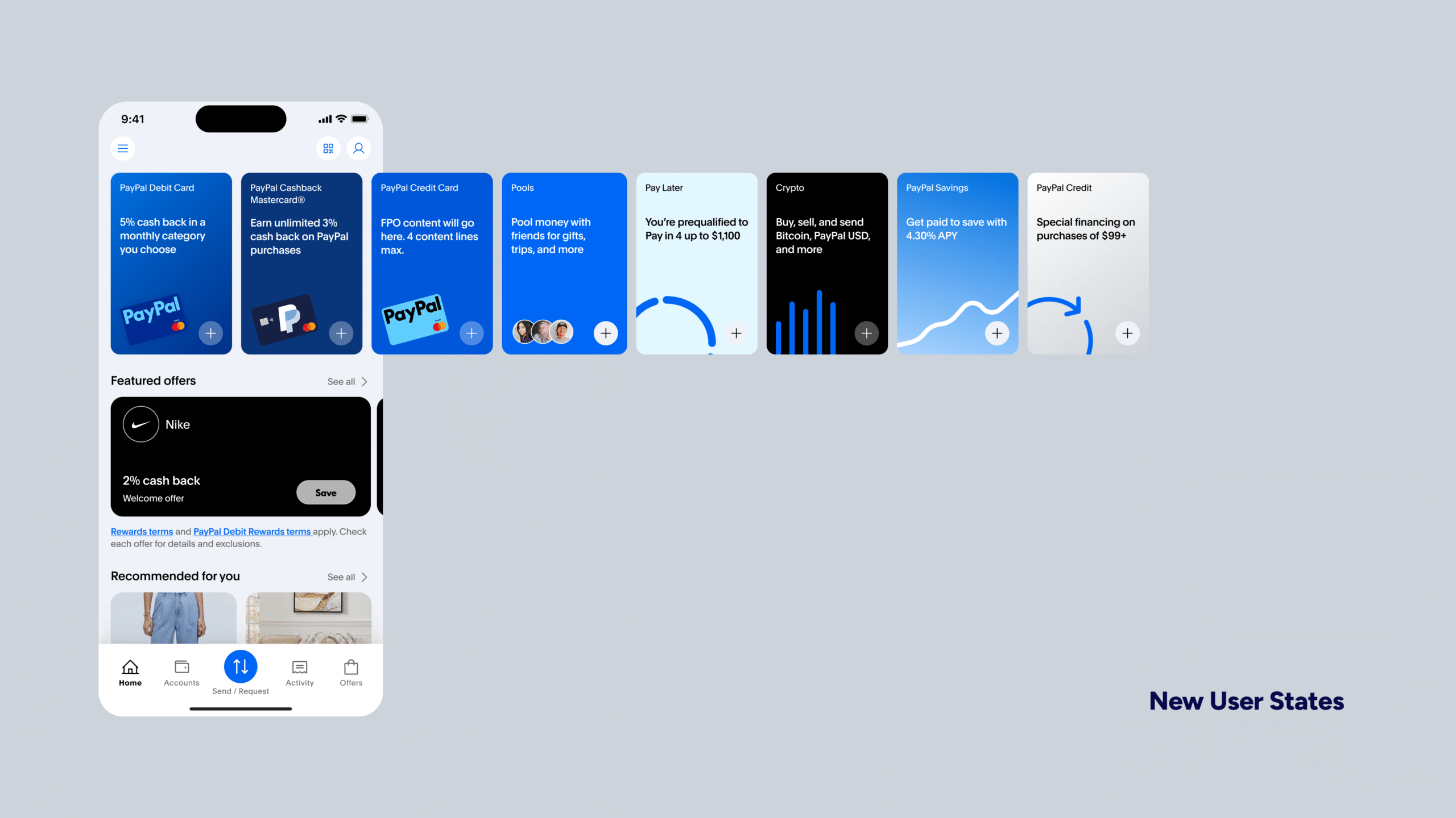
While data visualization wouldn’t make the initial release, leadership remained committed to the vision for a future iteration. With that in mind, I redesigned the experience using the same core principles and visual hierarchy, ensuring the structure could seamlessly scale into a data-driven state later. This allowed us to meet immediate business goals without compromising the long-term product vision.
Post-launch Results
The redesigned Home experience drove measurable improvements in product discovery, engagement, and debit card adoption. By simplifying hierarchy and surfacing high-value actions, the experience shifted from passive browsing to more intentional financial behavior.
+12%
+8%
~10%
Debit card entry-point CTR
Overall Home-to-product conversion
Repeat engagement w/ Home surface
Engagement & Discovery
- Improved hierarchy increased interaction with top-of-screen modules, particularly Financial Snapshot and rewards surfaces.
- Users were more likely to engage with primary financial actions without needing to scroll.
- Reduced visual competition led to faster decision-making and clearer navigation paths.
Adoption & Usage
- Debit card engagement increased through more prominent placement and clearer value framing (cashback visibility).
- Users showed stronger intent to explore financial products directly from Home rather than navigating through secondary entry points.
- Repeat visits to Home increased, signaling stronger reliance on it as a primary financial hub.
Clarity & Behavioral Shift
- Simplified structure reduced cognitive load, improving scannability and time-to-action.
- Users demonstrated more confident interactions, with fewer hesitations between steps.
- The Home experience transitioned from a cluttered dashboard into a clearer, action-oriented system.
Outcomes & Key Learnings
The final outcome was more than a layout redesign. It was a structural shift in how the home surface functioned within the PayPal ecosystem.
The experience transitioned from a cluttered dashboard into a product-forward gateway. It better supported business priorities while improving clarity for users. Engagement metrics improved, drop-offs decreased, and task efficiency increased.
The biggest challenge was the weight of responsibility. This was the first major initiative where I led such a large surface area. Navigating compliance, cross-functional alignment, system constraints, and business pressure simultaneously required maturity in decision-making.
If I were to approach it again, I would bring legal and engineering into even earlier ideation stages to accelerate alignment and reduce iteration cycles.
This project fundamentally shaped my design philosophy. In financial products, clarity is trust. And trust is everything.

Interested in working together?
Designed and built by Alejandro Garzon. © 2026 All rights reserved.