
Redesigning Engagement Cards at PayPal
Role
Lead UX Designer
Platform
iOS / Android
Timeline
Multi-quarter Initiative 2022-23
Team
Product, Engineering, Content, Research, Risk / Legal
Overview
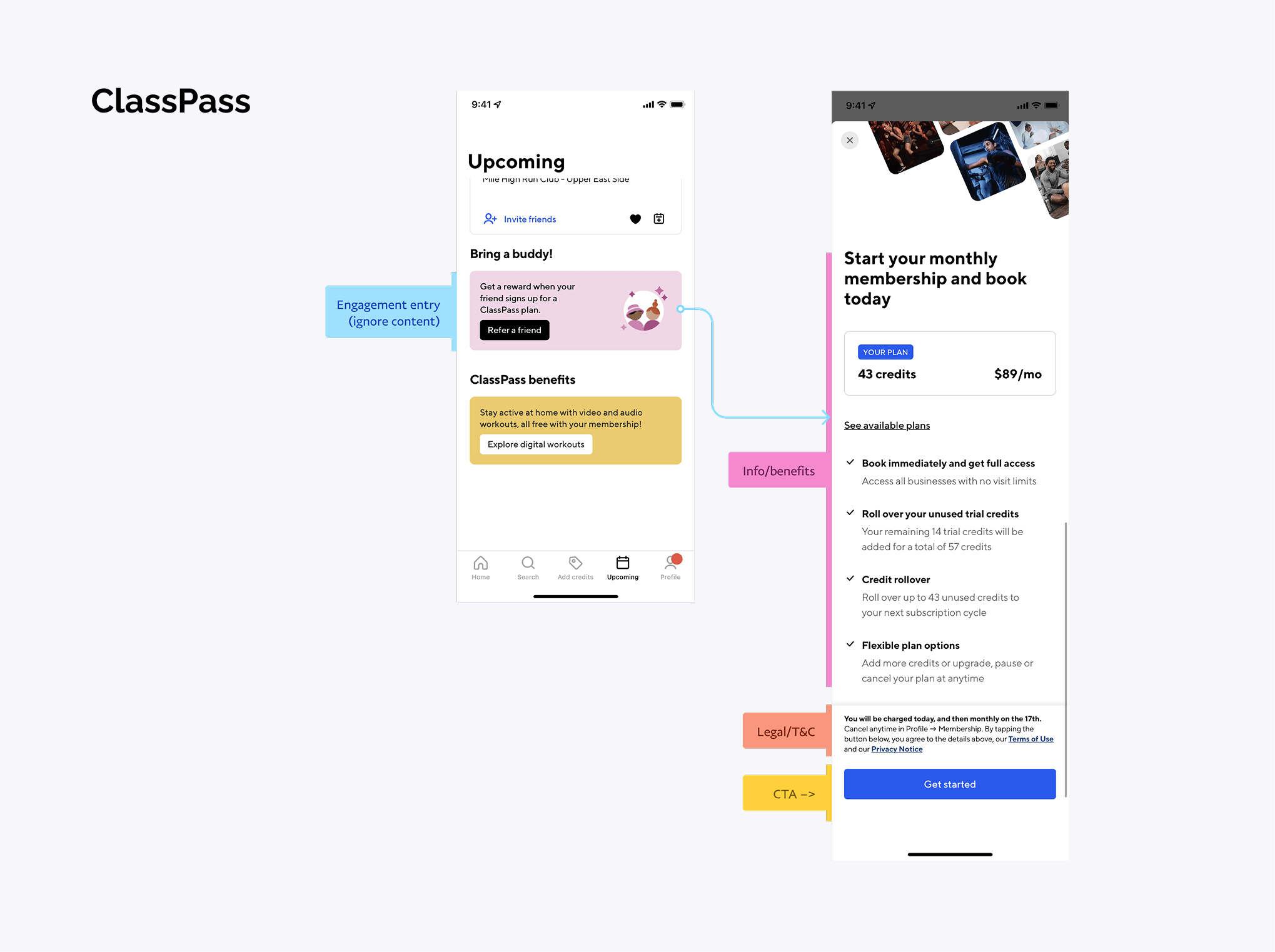
Engagement Cards are promotional surfaces in the PayPal app that drive product adoption, highlight offers, and encourage user action. They're one of the primary ways PayPal communicates value to users at key moments in their journey.
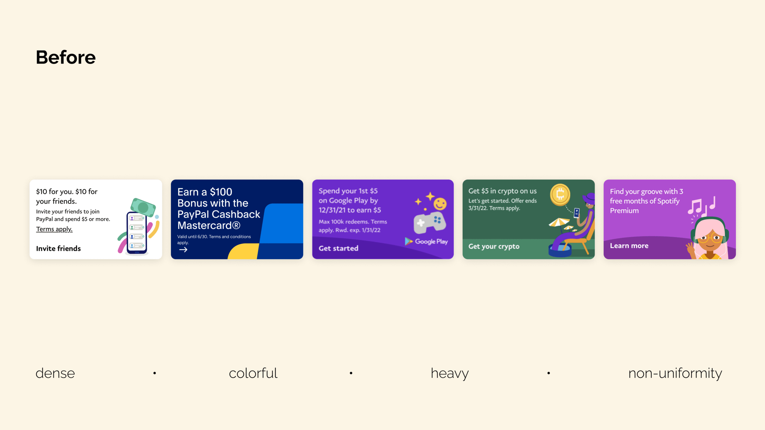
Over time, these cards had become fragmented. Multiple teams were building their own variations to support different goals, resulting in inconsistent patterns, duplicated work, and unpredictable performance across the app.
As a Senior UX Designer on the Product-led Growth & Engagement team, I led the redesign of Engagement Cards into a unified, scalable system that teams could use to deliver promotional experiences consistently — without sacrificing flexibility or speed.
The redesigned system became a critical driver of business impact, contributing over $200M in customer lifetime value while establishing the foundation for how engagement surfaces are built at PayPal today.
Key Outcomes
- Scaled engagement surfaces into a major revenue driver across product and partner experiences
- Cut time to launch by 2 to 3x by removing approval bottlenecks
- Reduced design and approval dependency by roughly 90% through a self-serve model
- Improved click-through rates by 18% across redesigned cards
Established consistent patterns that reduced visual noise across the app
$200m2-3x
~90%
+18%
Customer lifetime value
Faster time-to-launch via approvals
Less approval dependency
Click through rates
Empathize
Discovery & Research
Before redesigning the system, I needed to understand how Engagement Cards were being used across teams and how users actually perceived them.
Teams had been building their own variations of promotional cards, each optimized for a specific use case. The flexibility was useful in the short term but produced a fragmented experience where patterns, hierarchy, and behaviors varied significantly from one surface to the next. The internal guidelines meant to solve this had grown overly complex, offering too many variations without clear direction on when to use what.
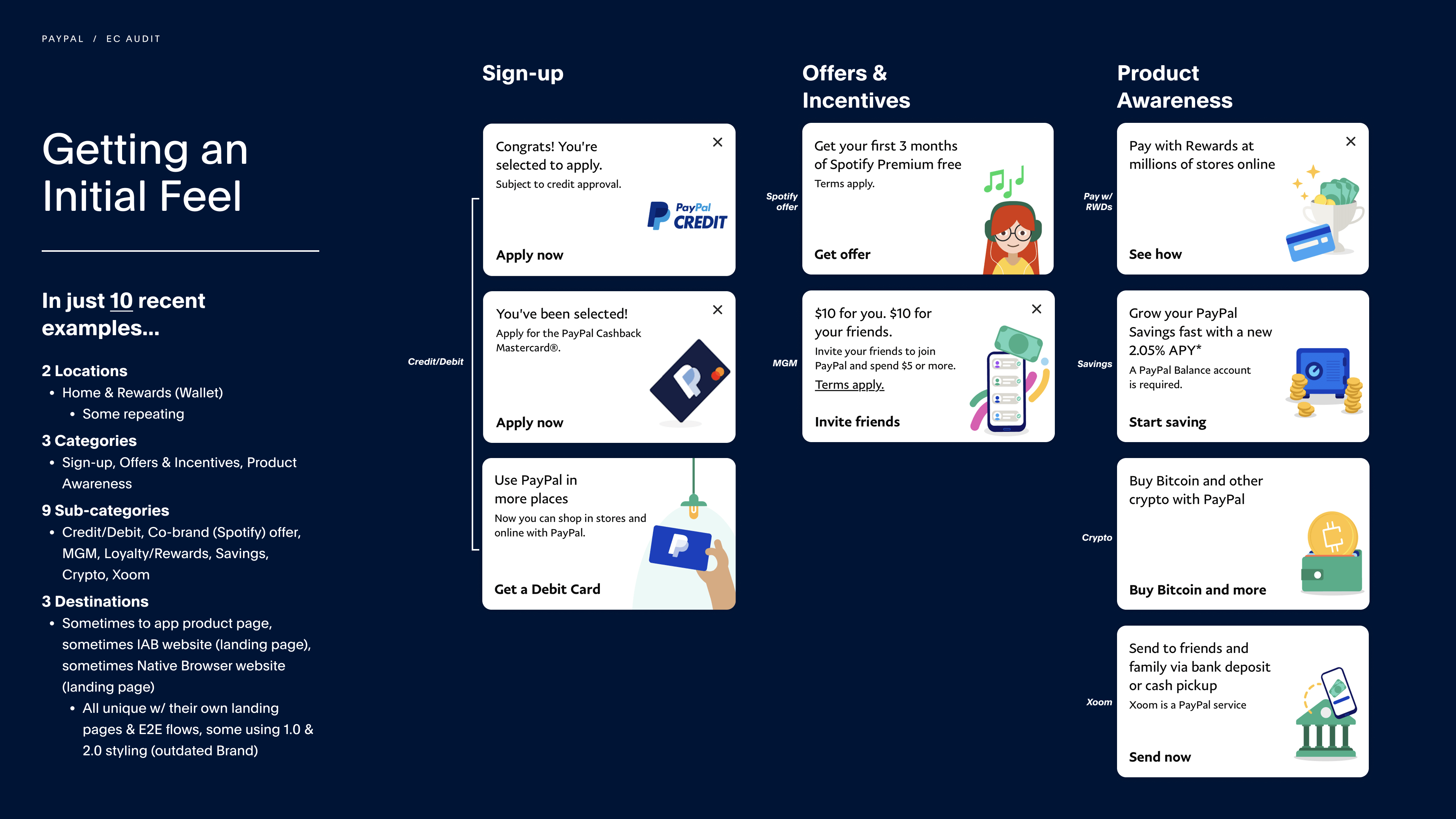
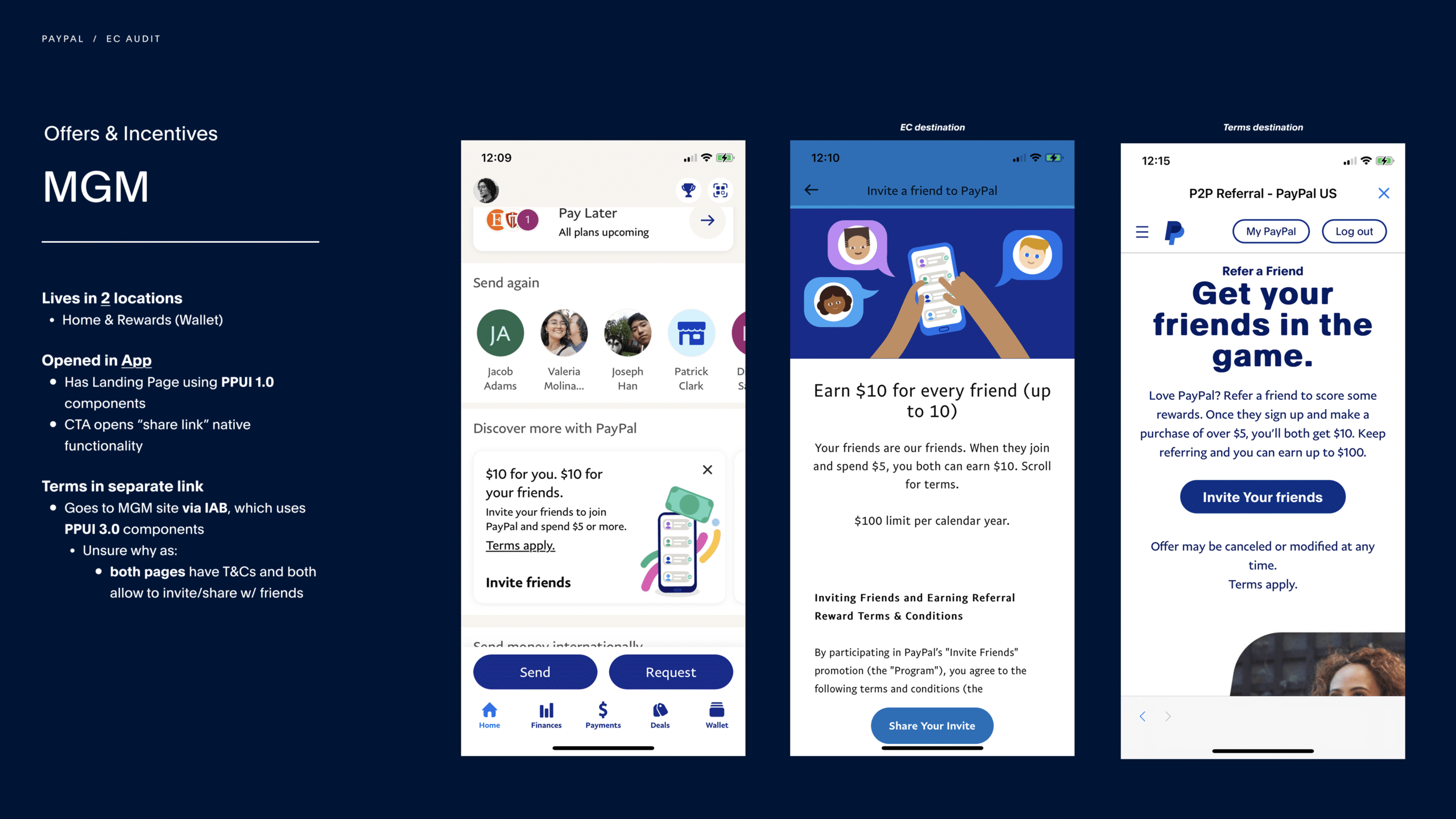
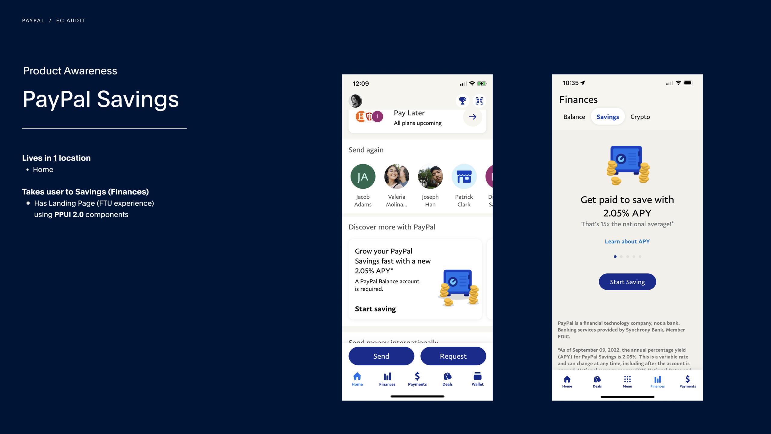
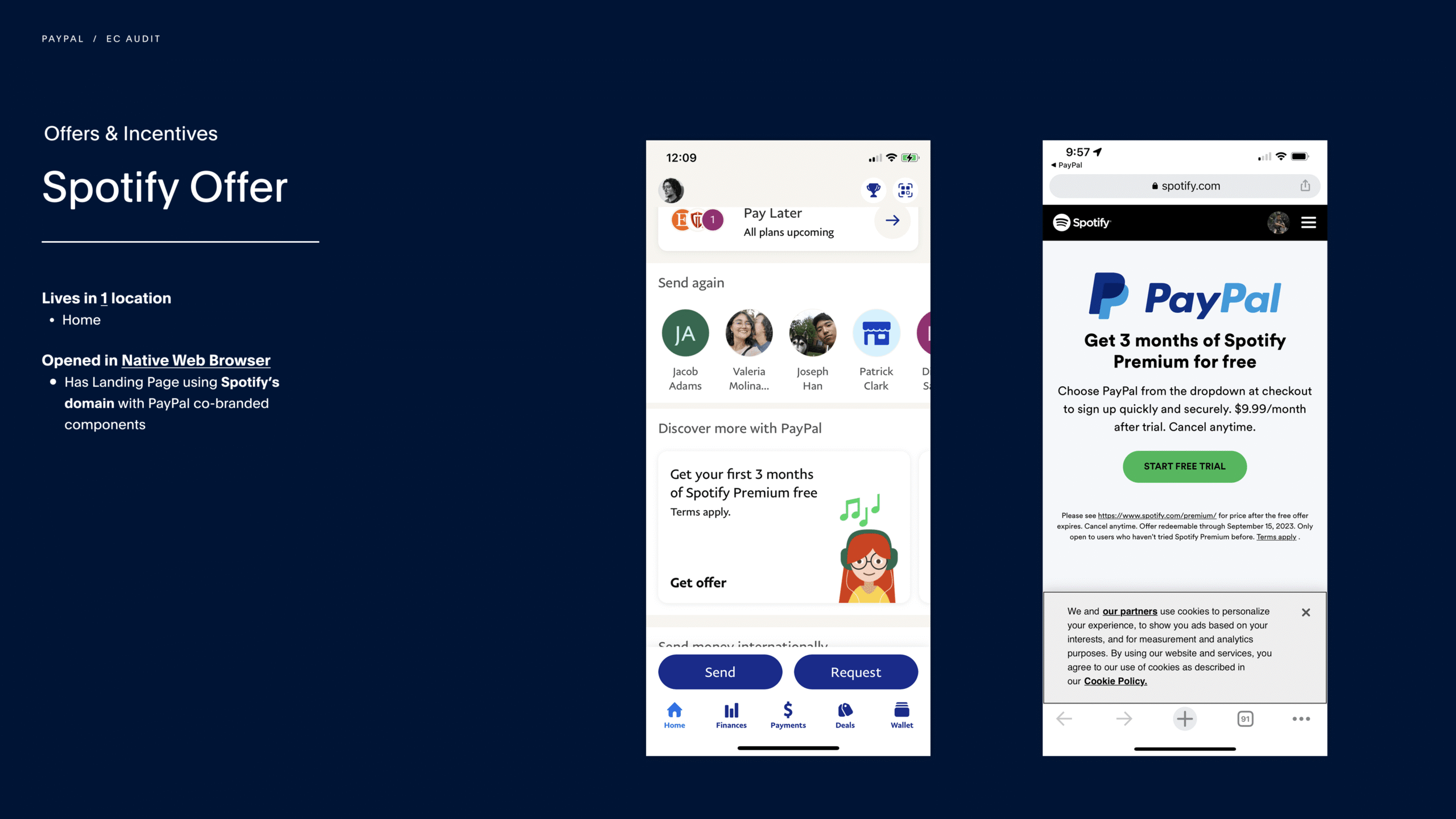
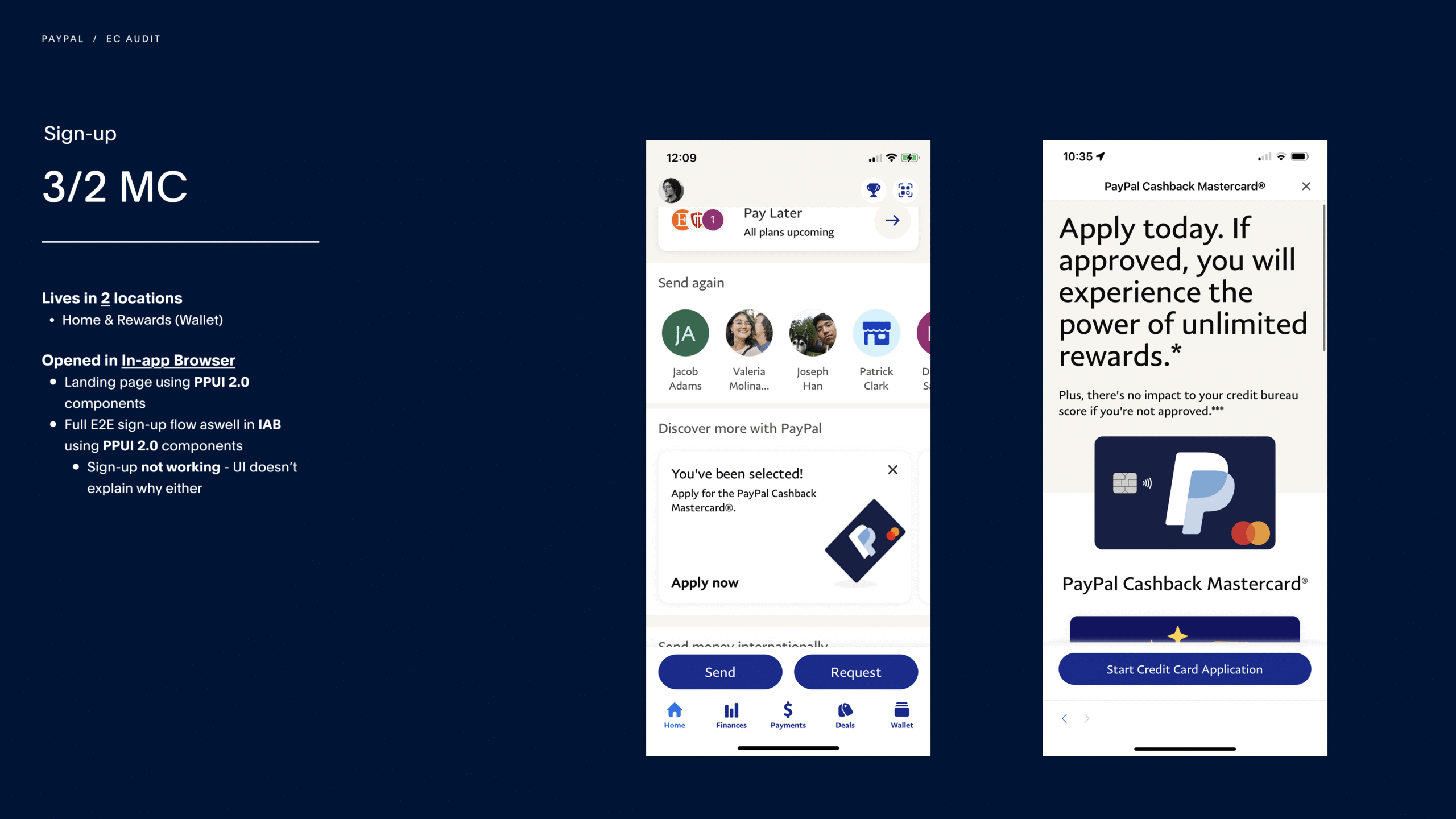
App-Wide Audit
To understand the scale of the problem, I audited Engagement Cards across the PayPal app, reviewing multiple use cases, surfaces, and end-to-end experiences.
:The audit surfaced:
- Significant variation across use cases like sign-up, offers, and product awareness, with no shared structure
- Inconsistent end-to-end flows across native pages, external sites, and the in-app browser
- Fragmented layouts, hierarchy, and visual styles across cards
- Redundant use cases solved in different ways by different teams
- A lack of governance that allowed teams to ship cards without clear guardrails
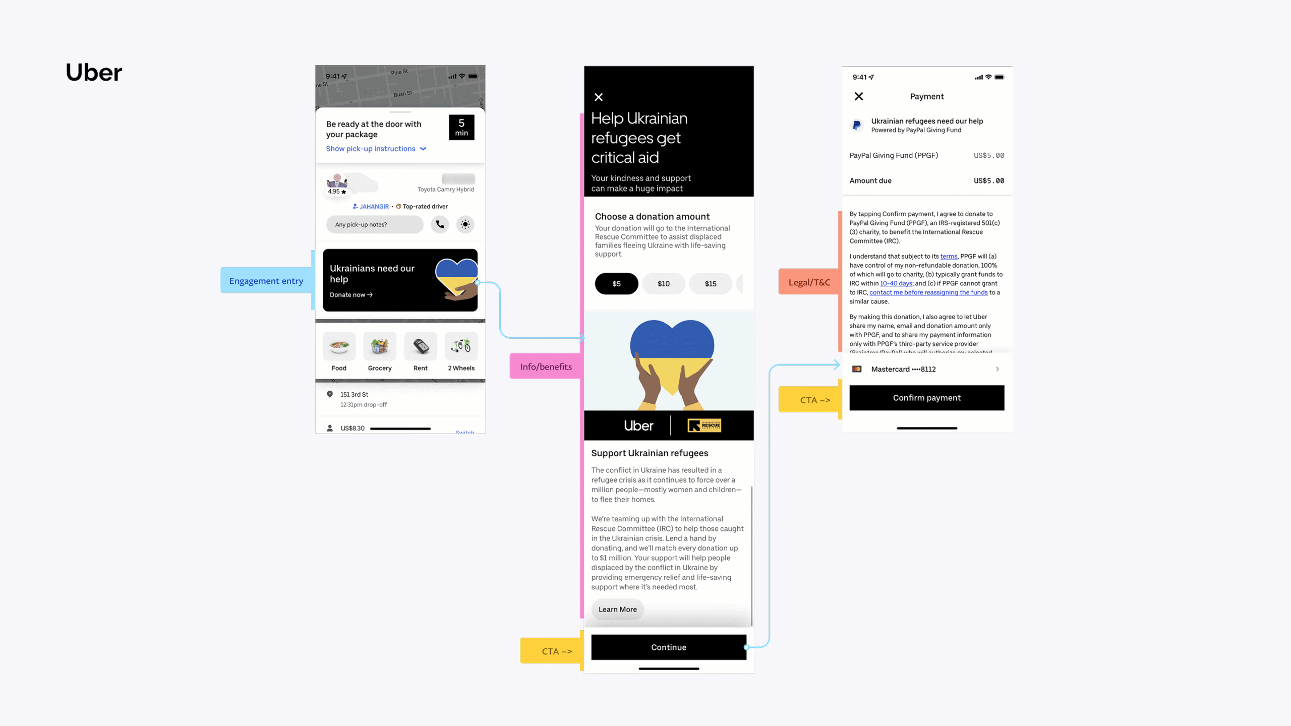
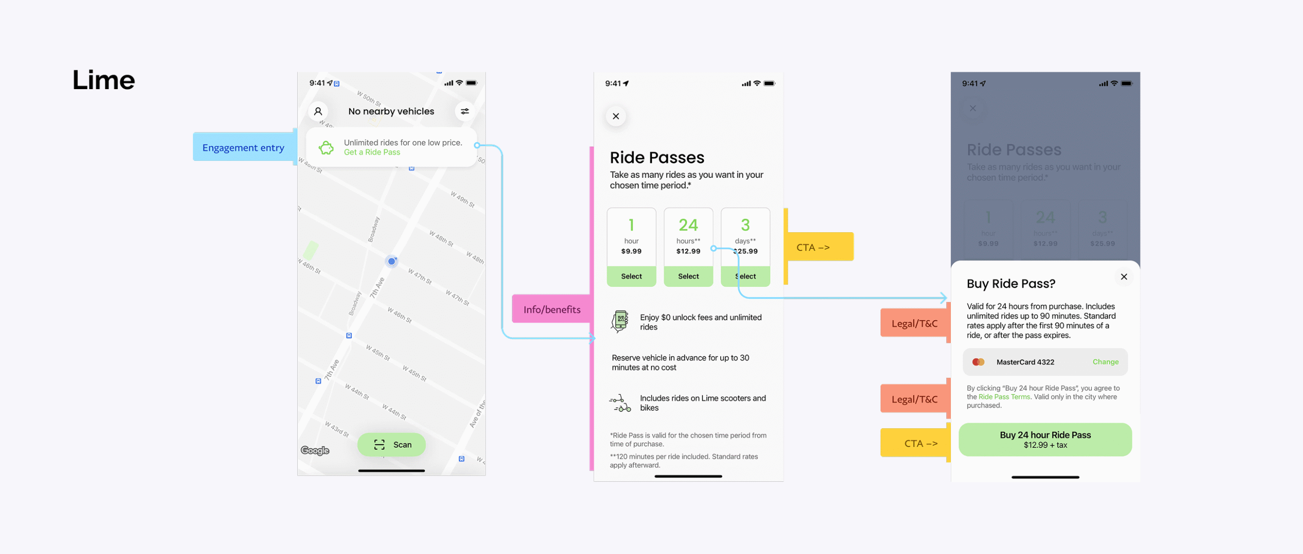
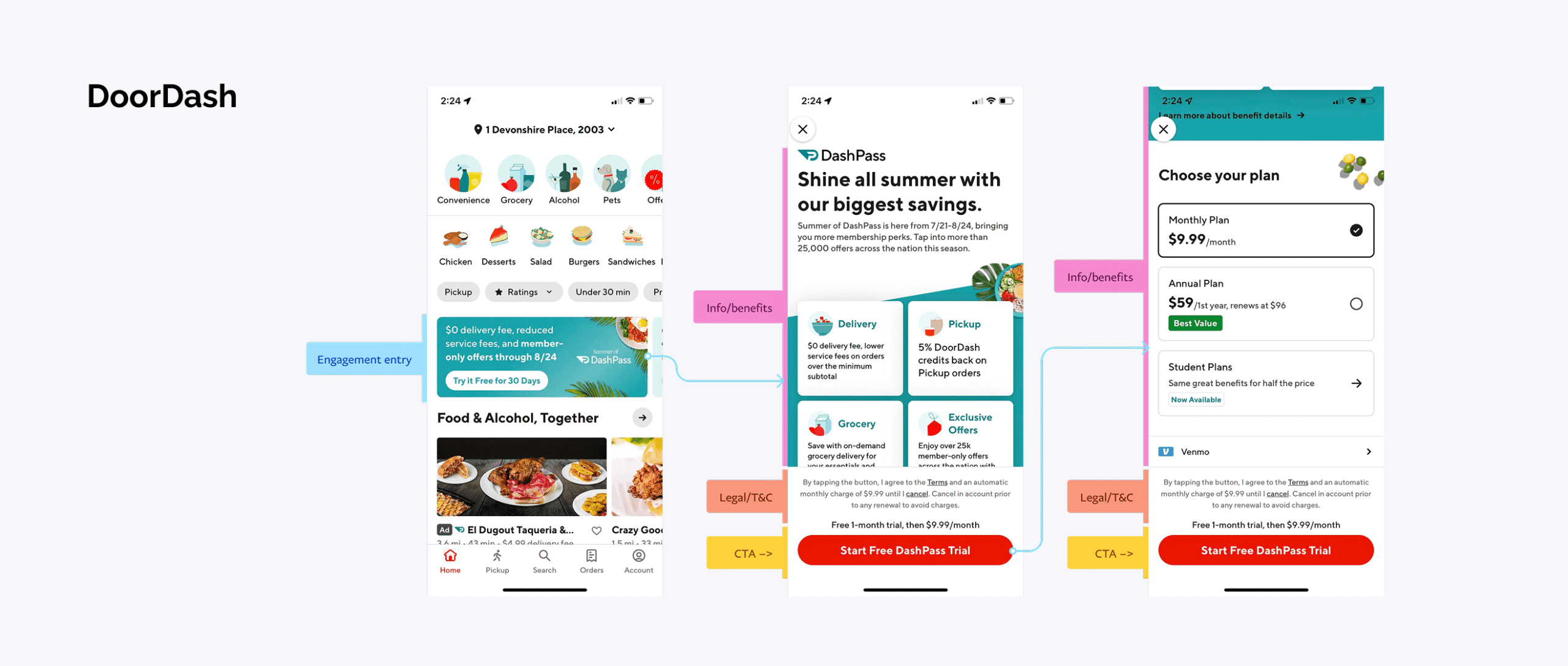
Market & Competitive Analysis
To contextualize these findings, we looked at how other platforms approached promotional content. The strongest experiences shared a few traits: they prioritized clarity over density, used fewer and more intentional surfaces, and relied on hierarchy and restraint rather than heavy branding to drive interaction.
Customer Research
We leveraged a previously conducted study on Engagement Cards that documented user perception and behavior. The findings directly shaped the redesign:
Key insights:

Users recognized cards as promotional content, but often treated them as ads and ignored them

Dense layouts and heavy branding contributed to banner blindness, reducing interaction

Visual noise and competing elements made cards harder to scan quickly in a feed-based environment
From a business perspective, PayPal needed a system that allowed teams to launch Engagement Cards quickly without heavy design and approval overhead. The existing process had become a bottleneck as adoption grew. The solution needed to introduce clear guardrails for design, content, and behavior while preserving enough flexibility to support a wide range of use cases, all without competing with core financial experiences.
Define
From Flexibility to Controlled Scalability
The challenge wasn't improving individual cards. It was restructuring the underlying system so it could scale across teams and surfaces without falling back into fragmentation. That meant reducing visual noise, standardizing behavior and navigation, supporting business priorities without overwhelming users, and giving teams a clear framework to build within.
Establishing Design Principles
To guide the redesign, I established a set of principles focused on balancing clarity with scalability, ensuring Engagement Cards could support diverse use cases while maintaining consistency and reducing noise.

1. Clarity over density
Reduce visual noise and improve scanability so users can quickly understand and act.

2. Consistency at scale
Standardize layout, behavior, landing and interaction patterns across all surfaces

3. Flexible w/in structure
Support diverse use cases while preventing fragmentation through defined patterns
These principles set a foundation for simplification, but they also exposed a deeper issue: the consistent patterns the team needed didn't yet exist. They would have to be intentionally defined, documented, and structured for teams to reference and reuse. That realization laid the groundwork for a more formalized system in the long run.
How might we:
"create a scalable Engagement Card system that enables rapid experimentation and growth, while maintaining clarity, consistency, and alignment with core product experiences?"
Ideate / Concepts
Deconstructing the Existing System
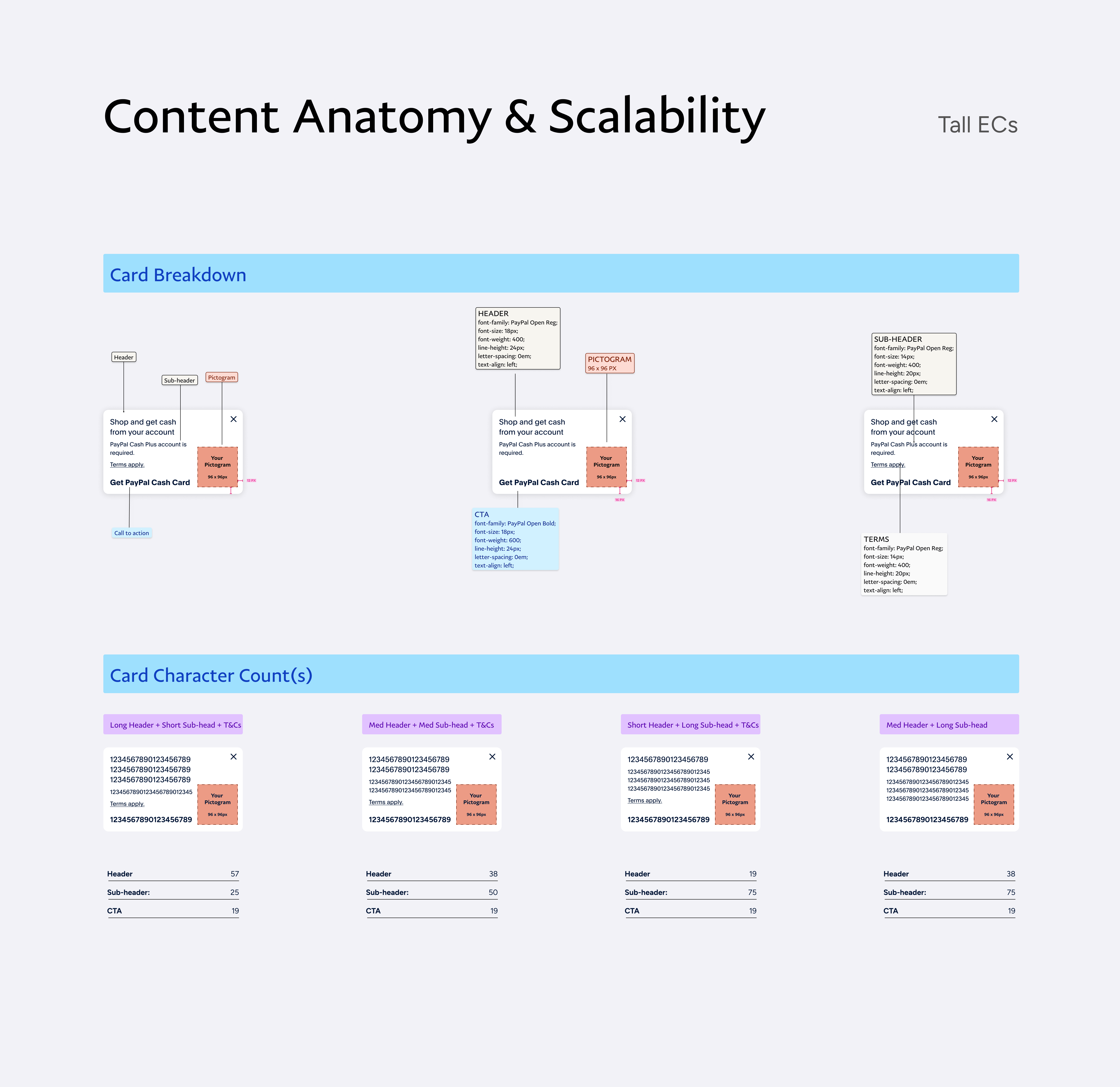
During ideation, I moved beyond individual card designs and focused on redefining the underlying system. I started by breaking down the existing Engagement Card anatomy to understand how layout, content, and visual elements were being used across teams. That made it easier to see where complexity was being introduced and where opportunities to simplify existed.
Exploration Across Layout, Content, and Form
To address the inconsistencies surfaced in the audit and research, I explored a wide range of design directions to better understand how layout, content, and structure impacted clarity, usability, and scalability. The phase focused on identifying what should be standardized, constrained, or restructured to reduce visual noise and improve consistency across cards.
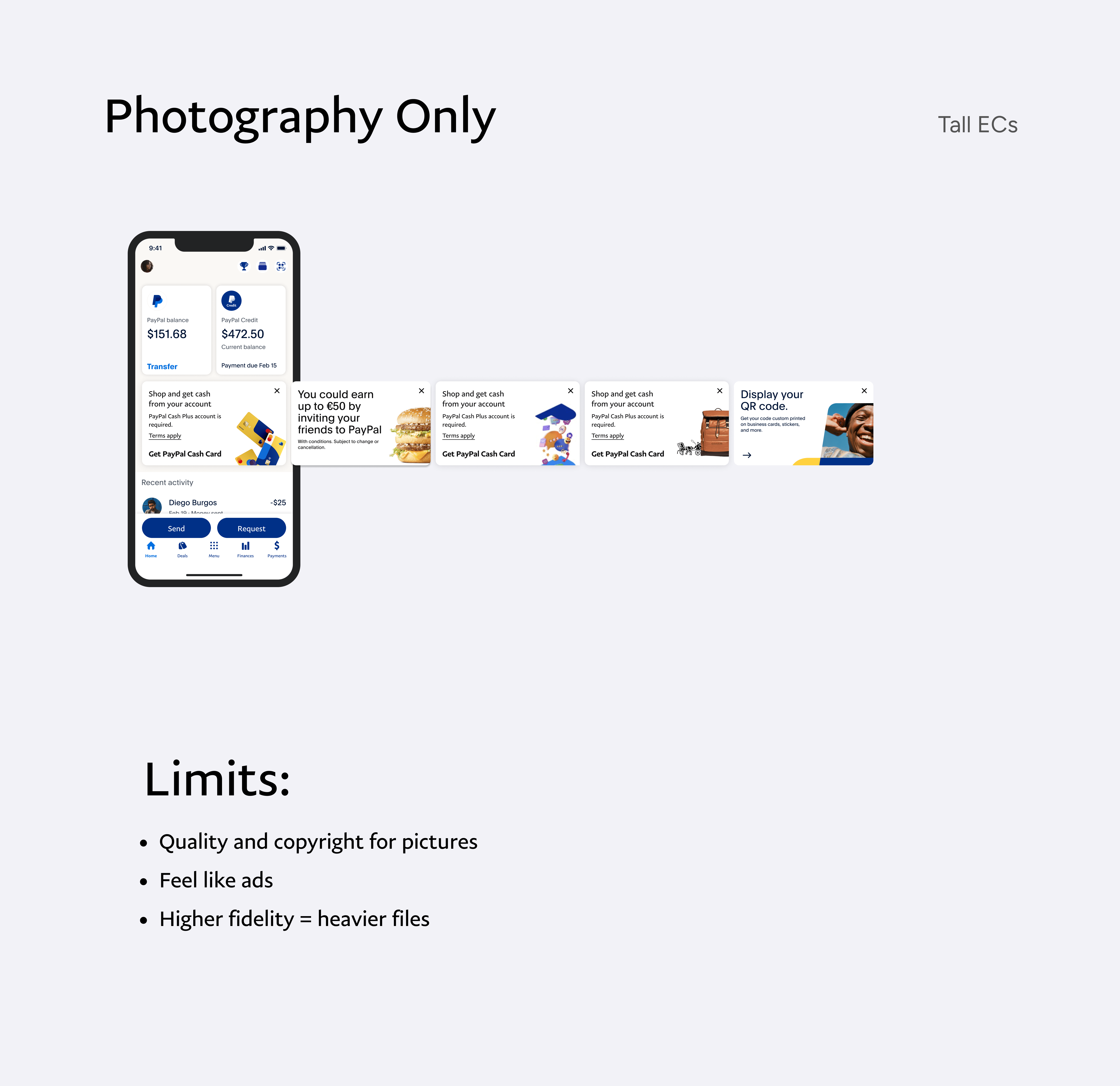
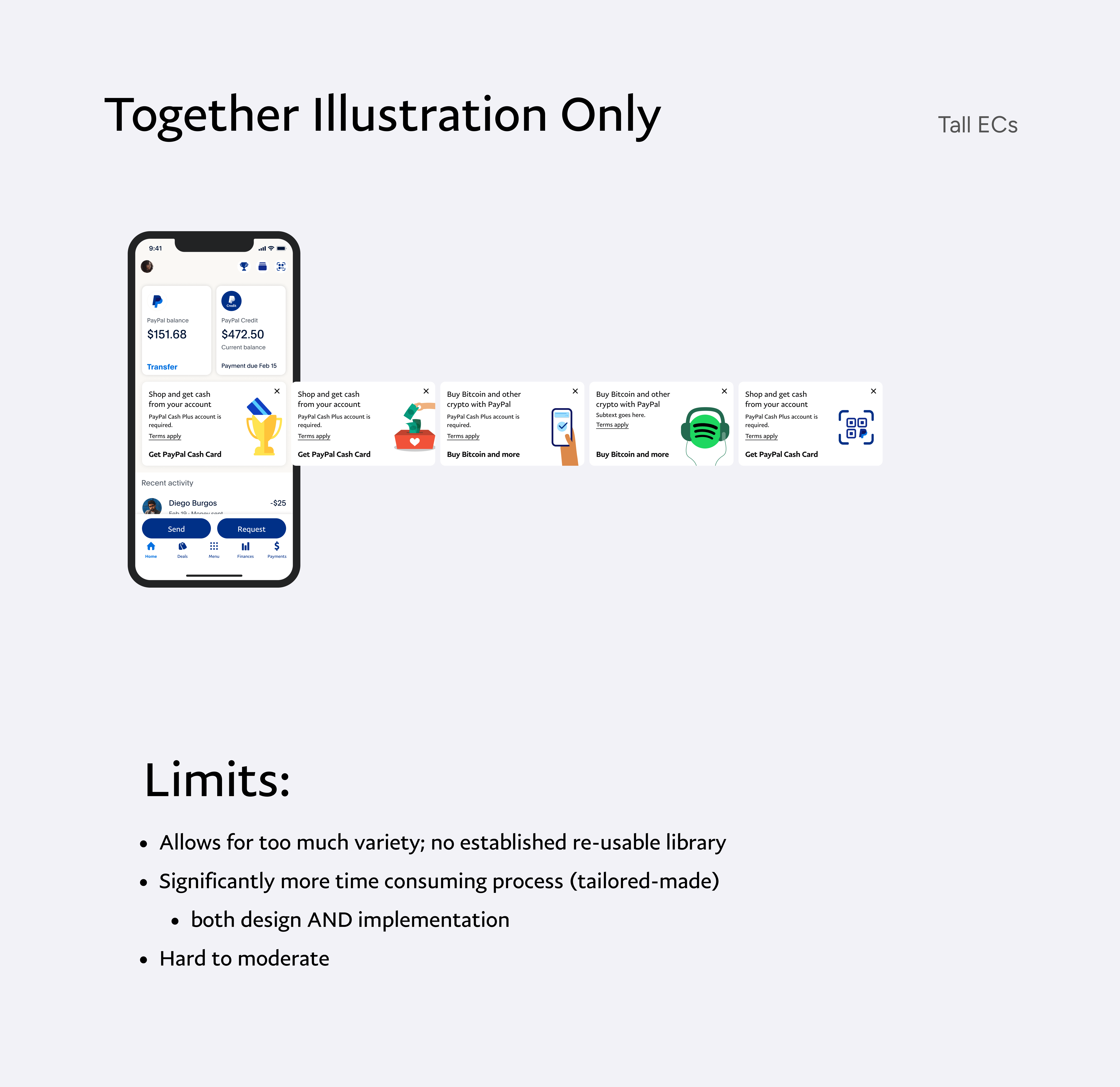
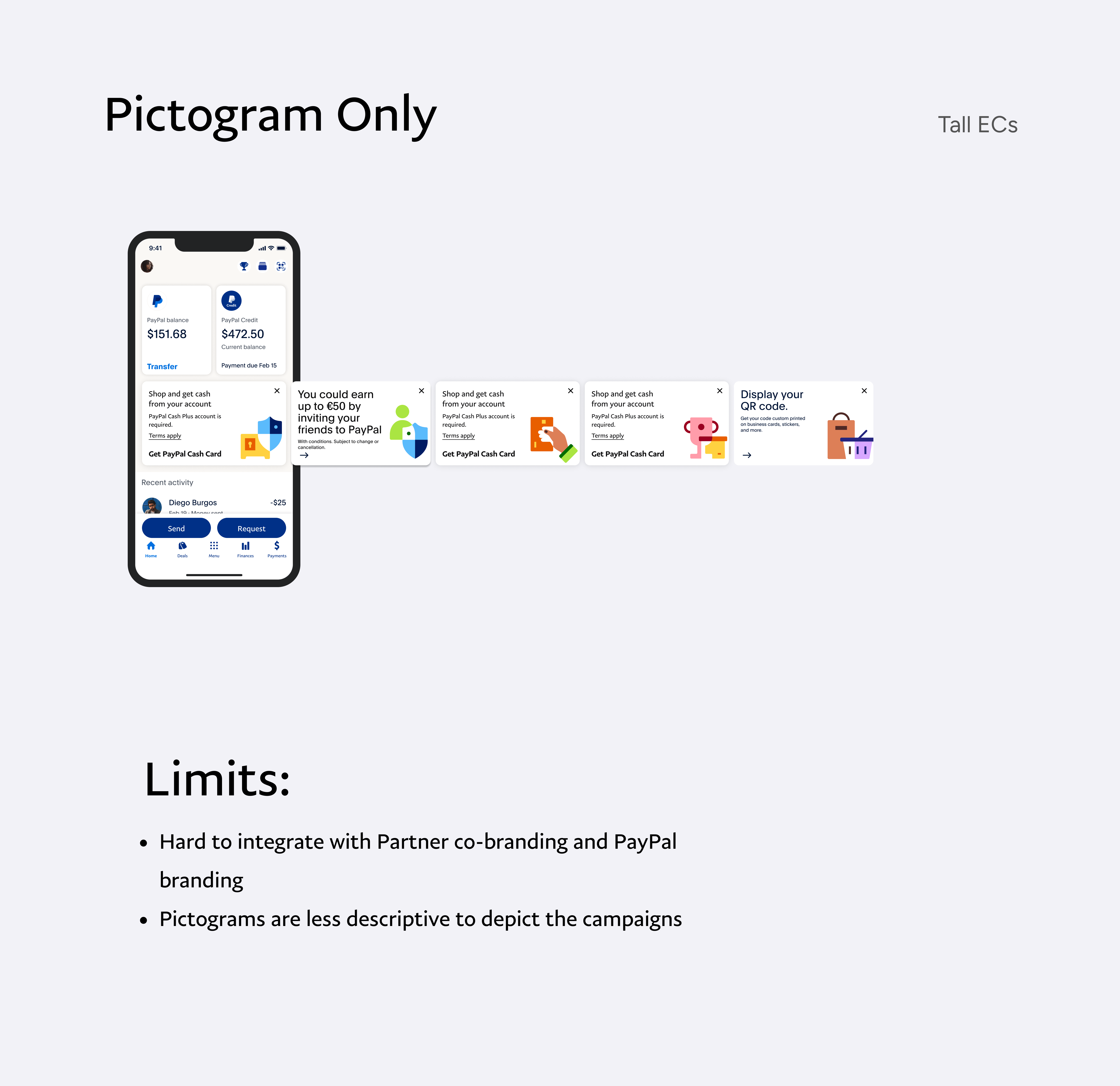
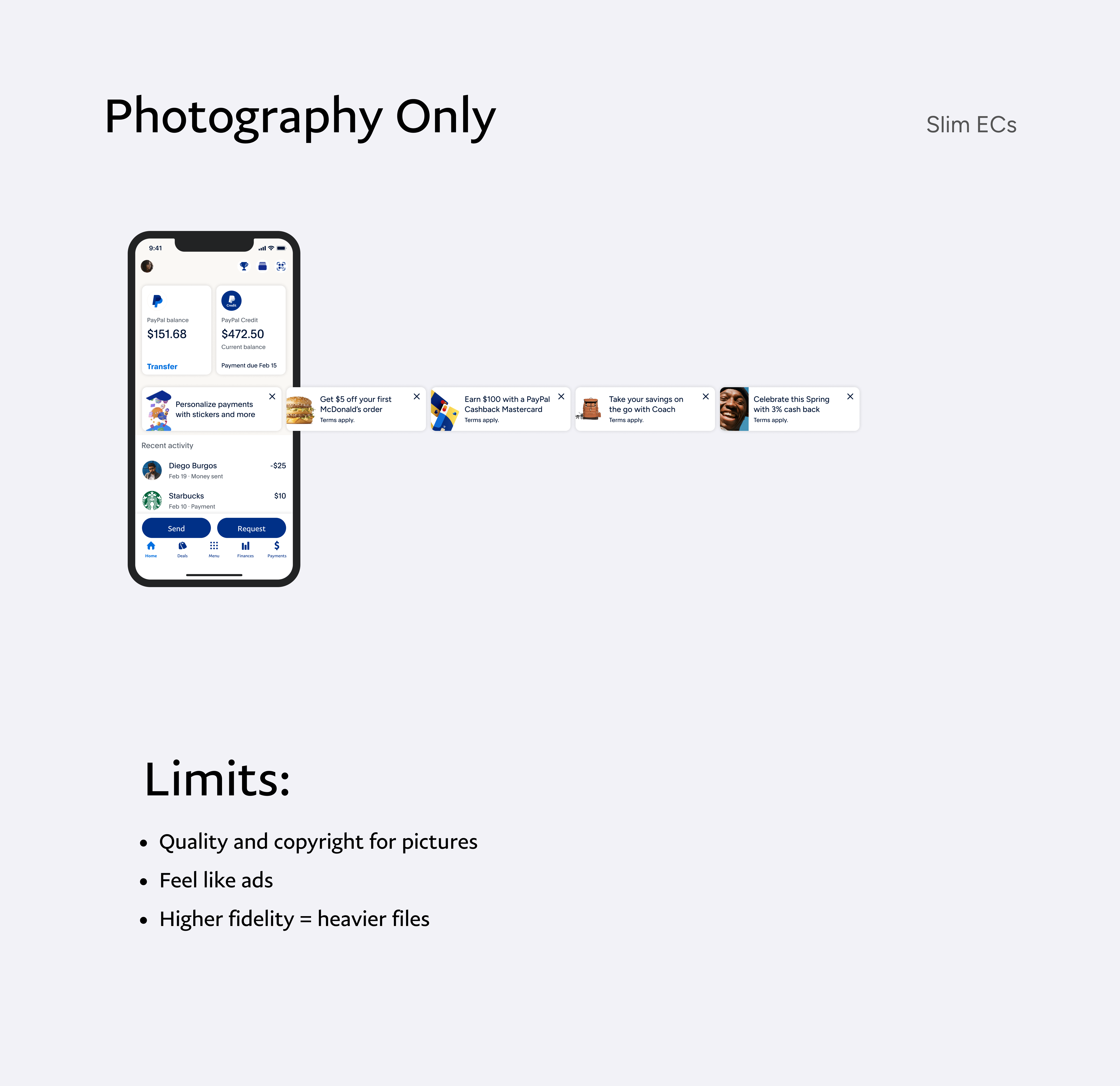
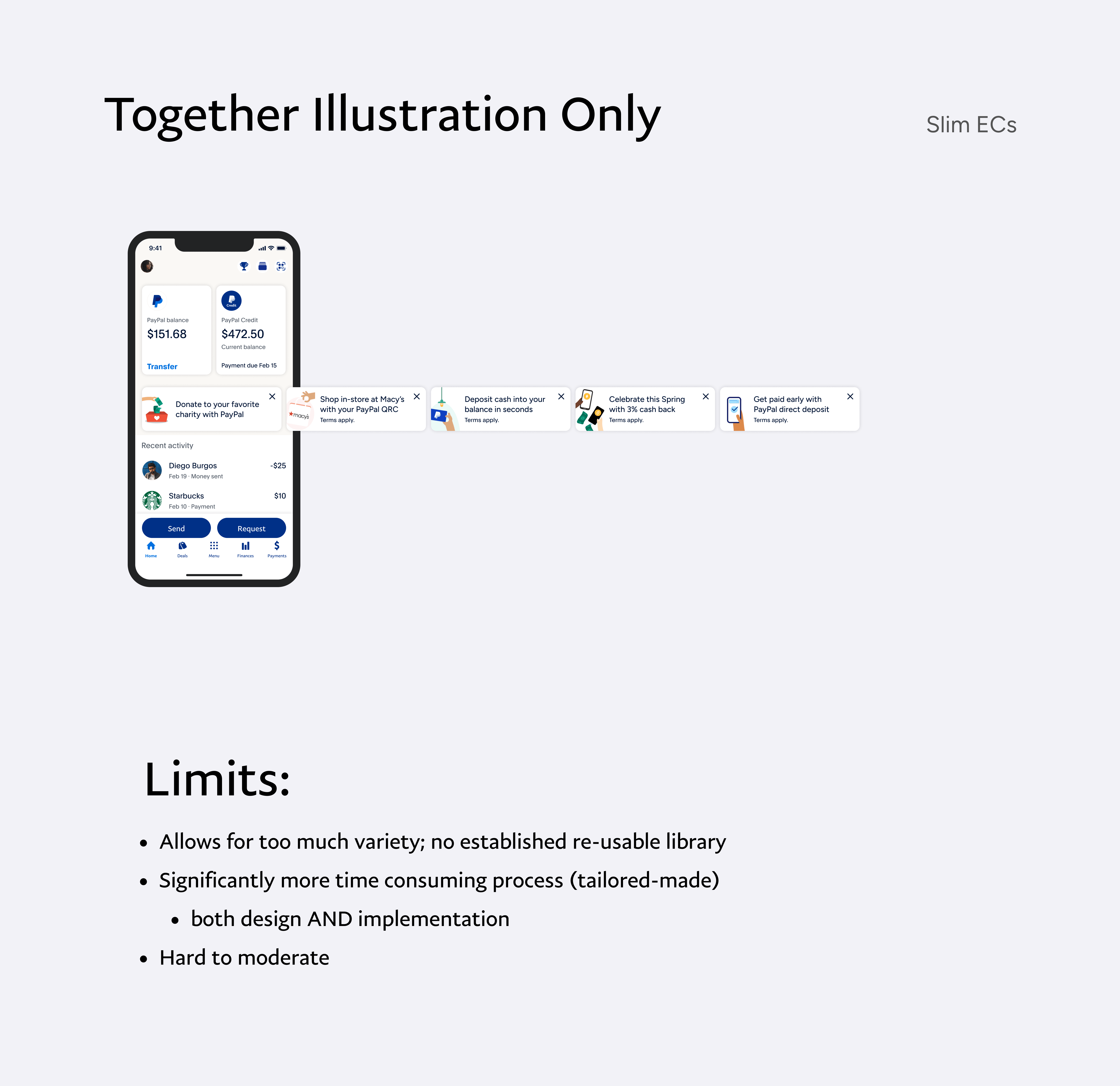
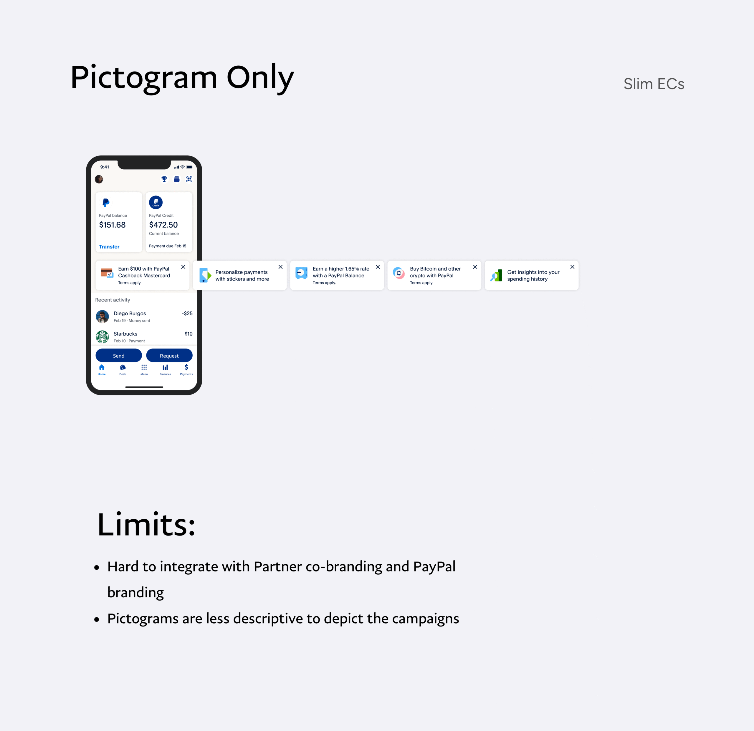
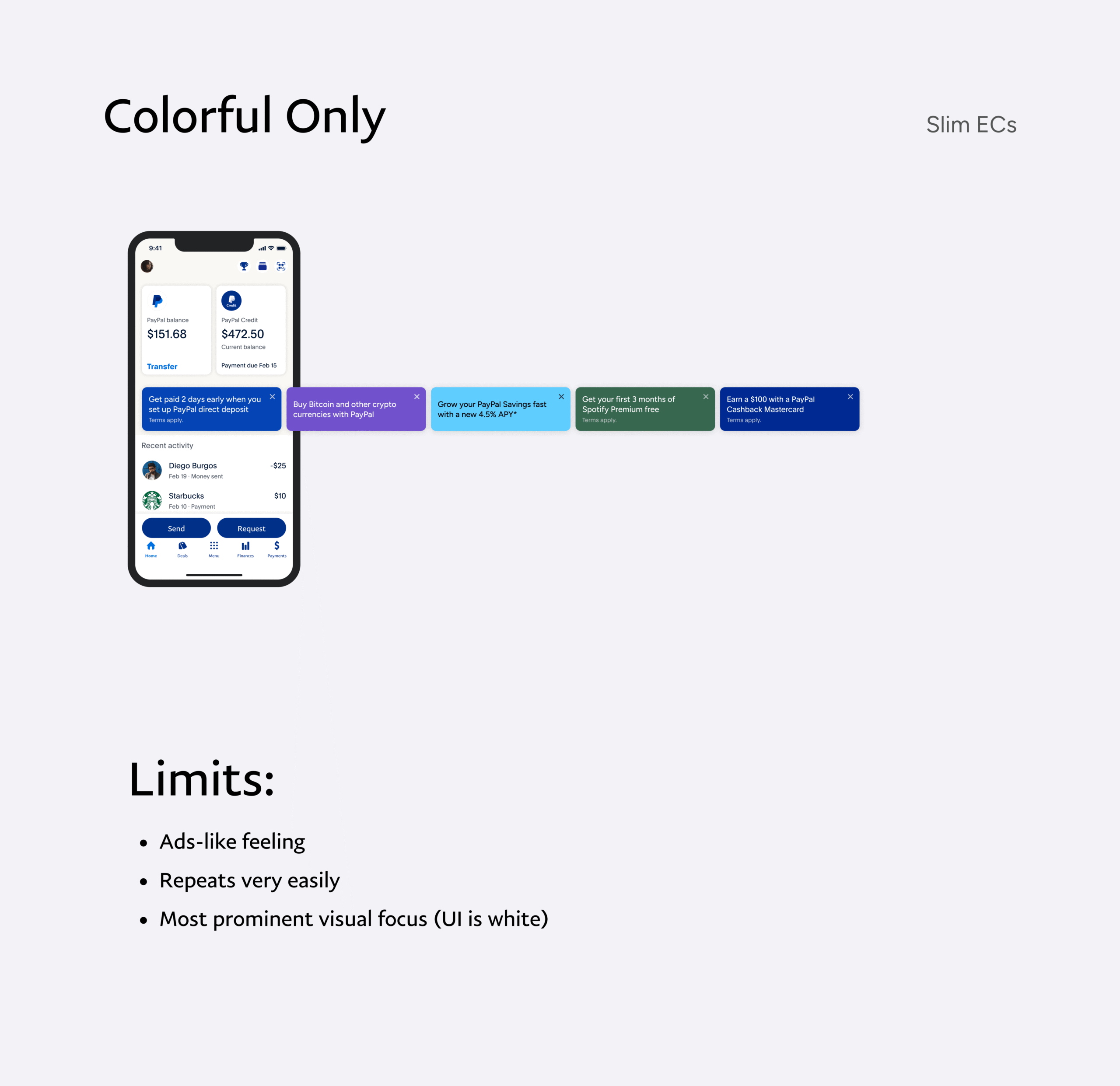
Part of this work meant rethinking the visual language itself. PayPal Design Systems was sunsetting the "Together Illustrations" that older Engagement Cards relied on, so I partnered with that team to understand where the brand was heading and adapt accordingly. Much of this happened against a moving target, designing with assets that weren't finalized yet, which pushed me to explore directions beyond illustration entirely. That included color-forward layouts, photography, and PayPal's new pictogram library.
What We Tested
- Different layout structures to evaluate clarity and scanability
- Card sizes to understand their impact on hierarchy within the feed
- Content limits to prevent overfilled, hard-to-read cards
- Visual styles to align with a more cohesive and simplified system
- Placement of legal and supporting information across card vs. landing

Key Signal from Exploration
Across every direction, one issue surfaced consistently: content density. Even when layouts improved, cards became ineffective when too much information was packed into too little space. Density became the primary constraint to address before the system could scale.
Tackling Content Overload
Resolving Content Density
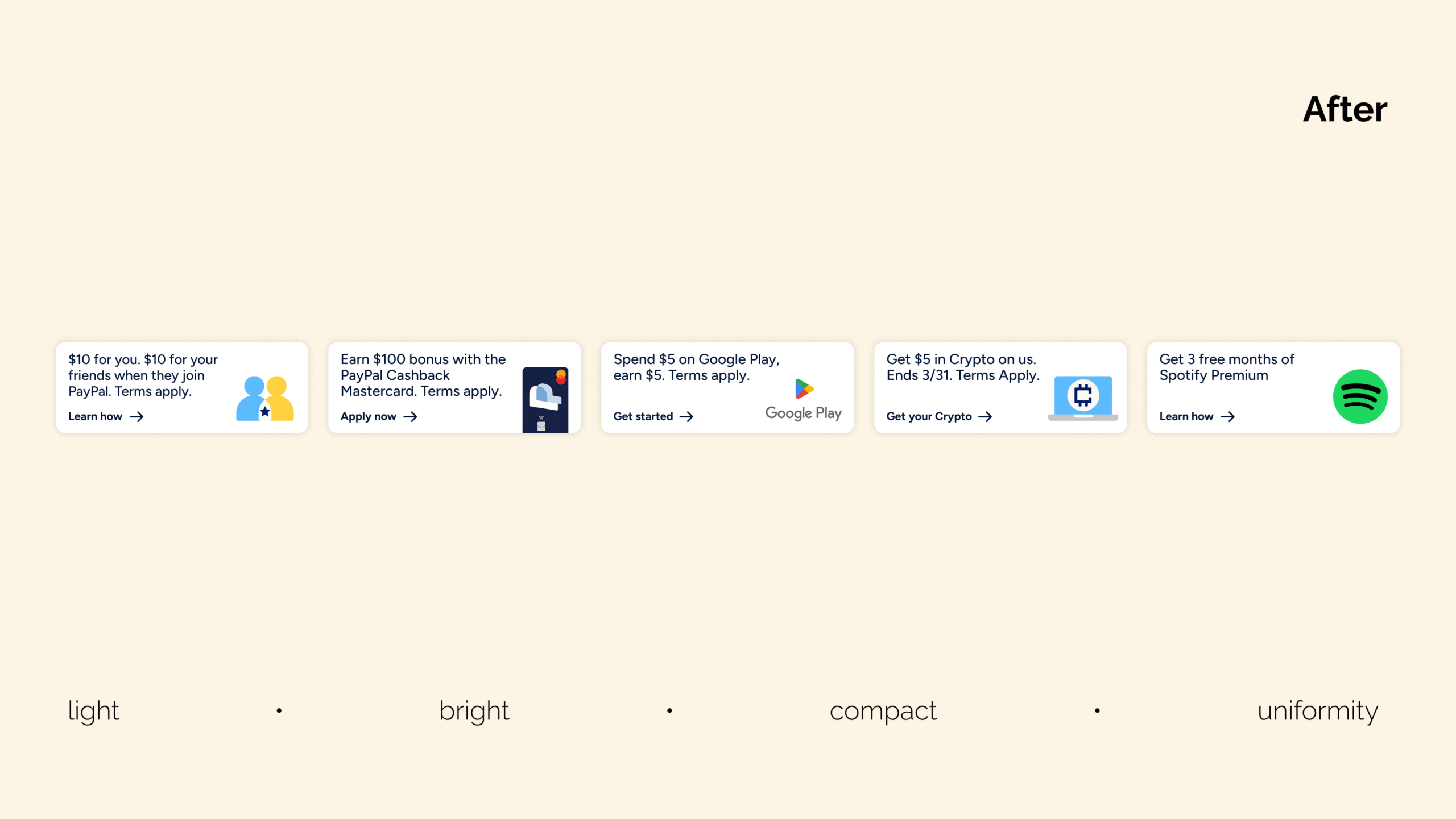
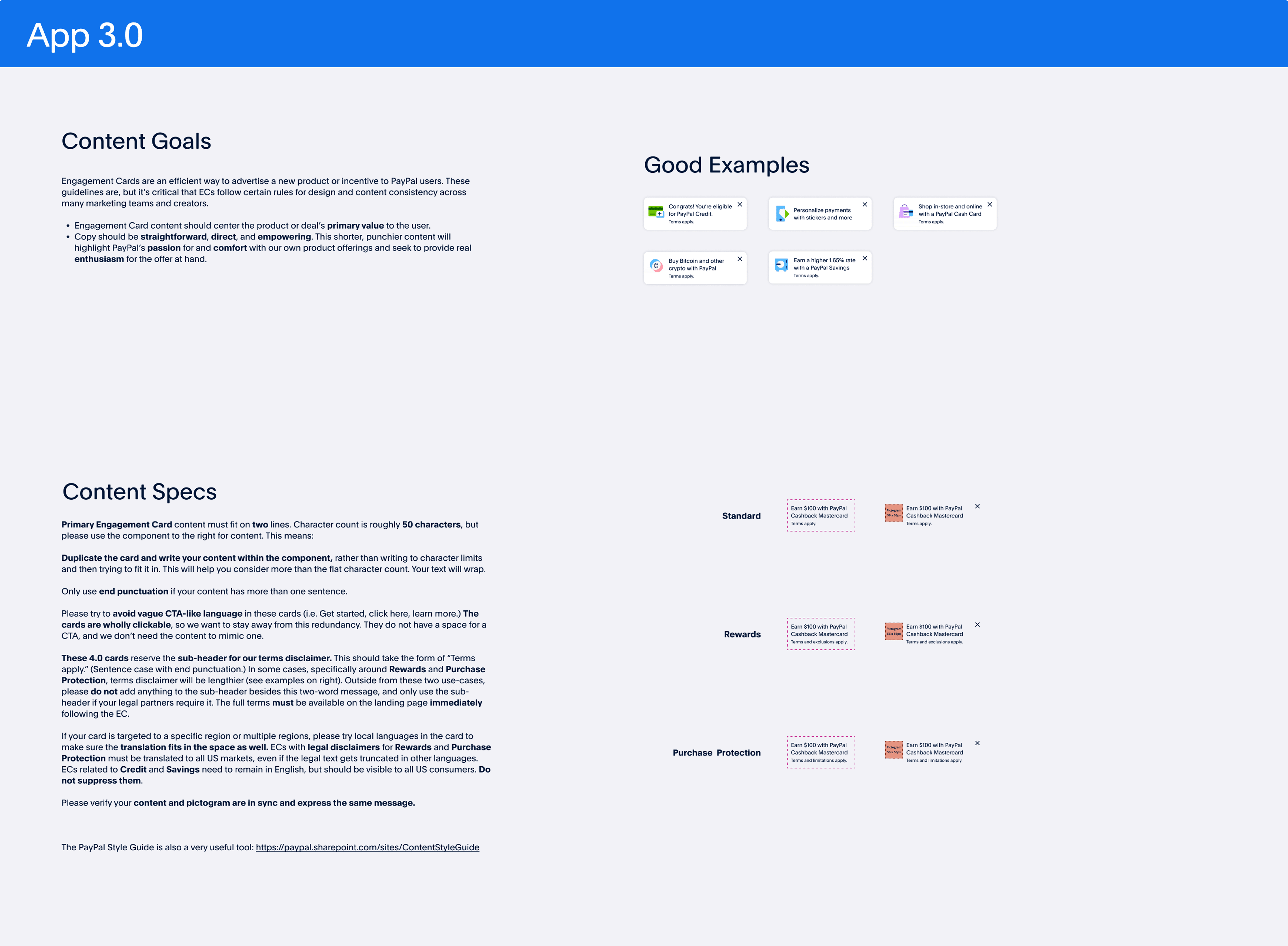
Cards routinely tried to communicate too much at once. Copy ran long, multiple value propositions competed within a single card, and dense legal language ate up space that should have been carrying the offer.
I partnered with Content Design to audit and rewrite past cards, proving that most could deliver the same value with significantly less content when structured correctly. For the legal copy, I worked with Risk and Legal to revisit what was actually required. I brought in market research showing how other companies handled similar disclosures with far less text, which shifted the conversation from "we have to say all of this" to "what do we actually have to say, and where." We landed on a simpler standard: most cards only needed a lightweight "Terms apply" callout, with full details moved to the landing experience.
The result was a set of cards that were more focused, scannable, and action-oriented without sacrificing compliance.
Pushing It Further
After presenting this work, leadership pushed us to take it further. The reasoning came from a broader shift happening across the Home screen. PayPal was in a transition period focused on rebalancing visual attention across Home, giving more room to core financial products and other surfaces that had been getting pushed out of view. Engagement Cards were one of the largest surfaces on Home, and their size was actively crowding out the rest of the experience.
The challenge was to slim the cards down more aggressively so they could coexist with the other content on Home, raise the bar on partner content to make every word count in the smaller footprint, and let the visual system stay deliberately quiet so the message could carry the card. That round of iteration produced a leaner, more disciplined set of cards where content did the heavy lifting and the visual treatment supported rather than competed.
Solution
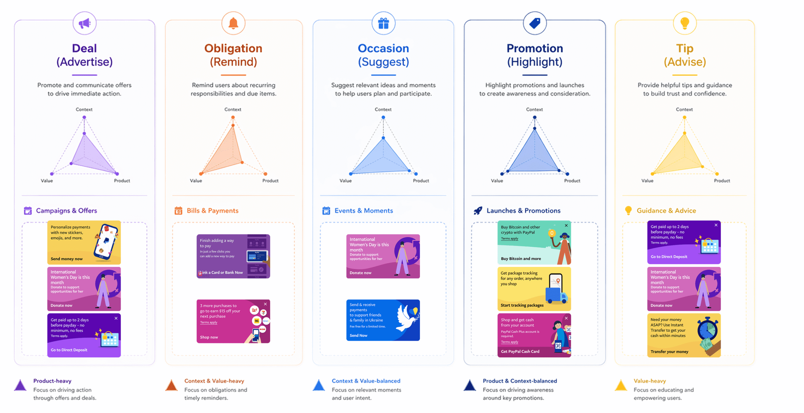
A Unified Engagement Card System
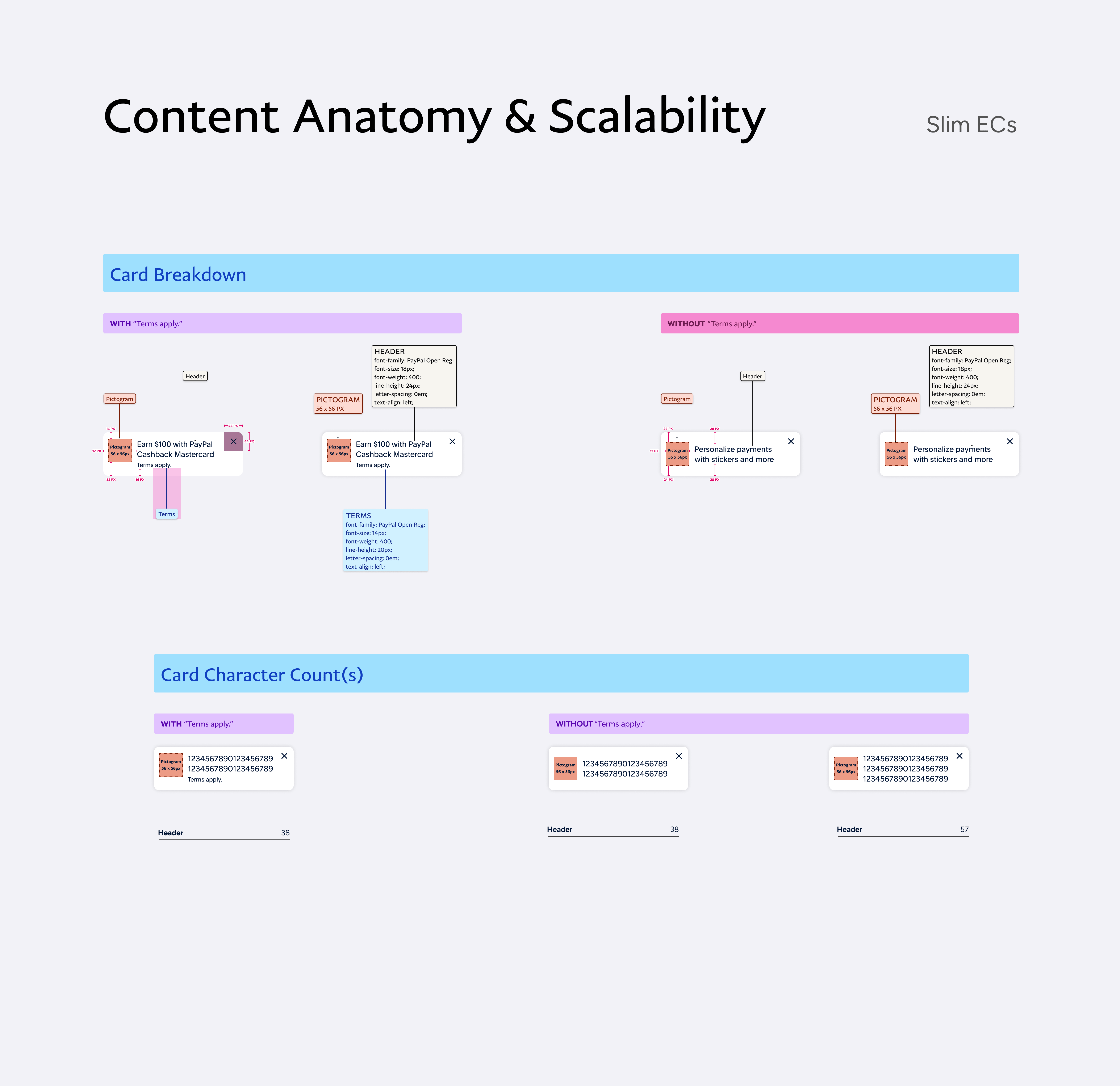
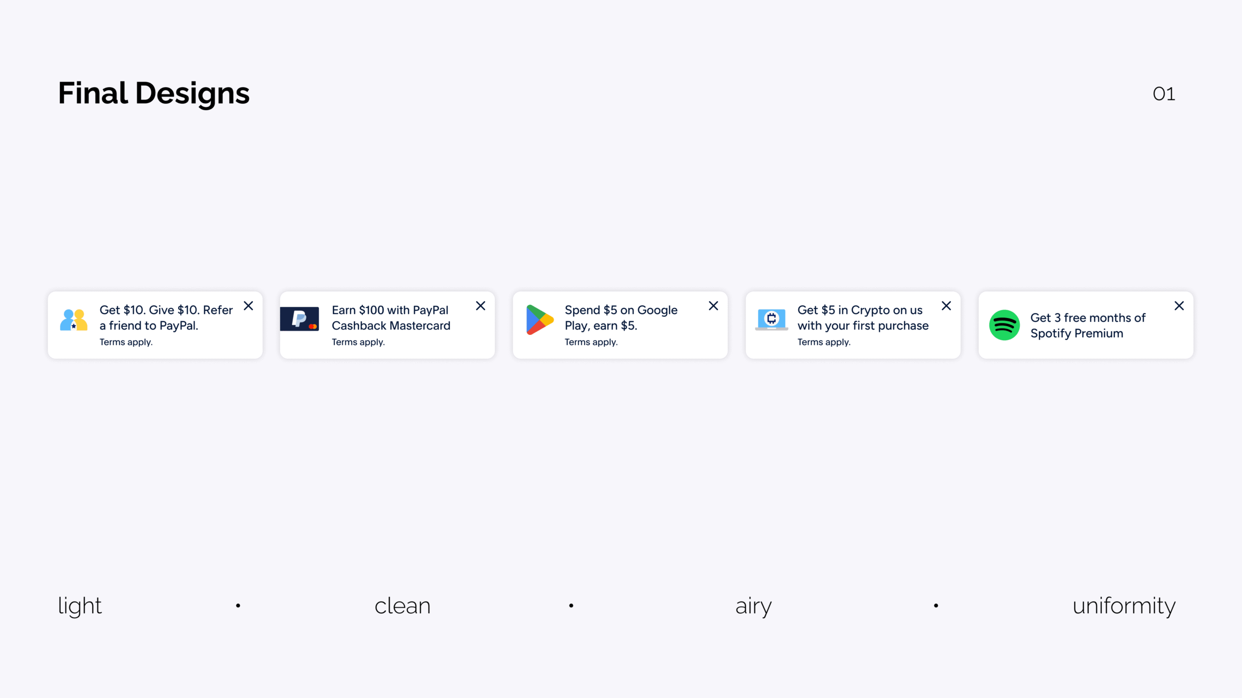
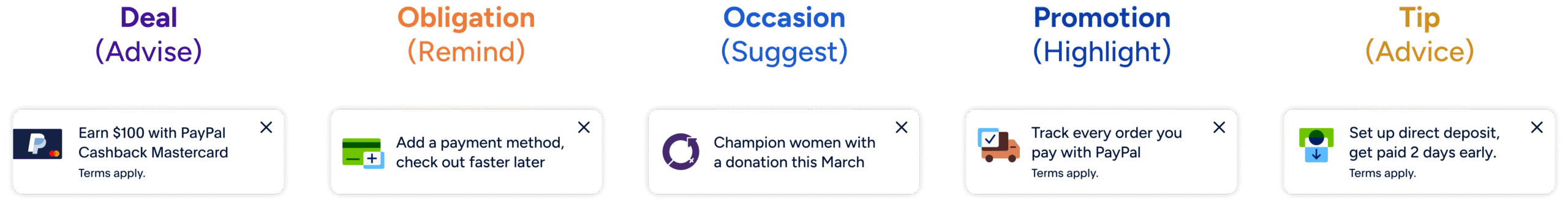
The final system replaced a fragmented set of one-off cards with a structured framework built around four card categories: Obligation, Occasion, Promotion, and Tip. Each category maps to a specific user intent and carries its own content rules, behavior patterns, and recommended use cases, giving teams a clear starting point based on what they're trying to communicate.
Within each category, the system defines a consistent anatomy: a uniform visual structure, defined content limits, standardized legal placement, and predictable interaction patterns.
Content as the Hero
The slim card format intentionally puts content in the spotlight. With less space and fewer visual elements competing for attention, the value proposition has to be sharp, clear, and immediate. That's a higher bar than it sounds. Crafting a strong, digestible message that fits inside a slim card takes real wordsmithing, and partners now spend their effort there instead of on visual decisions.
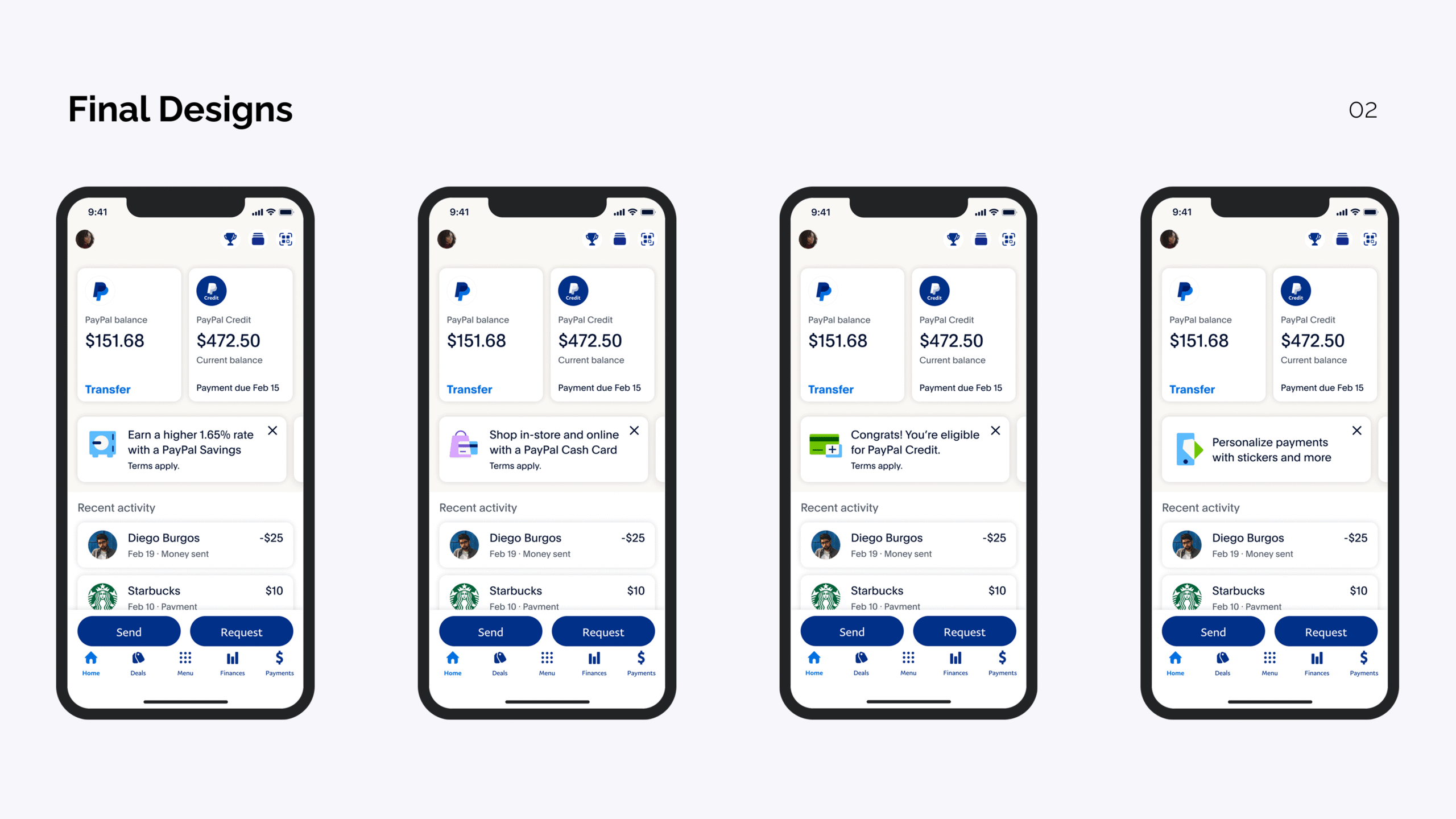
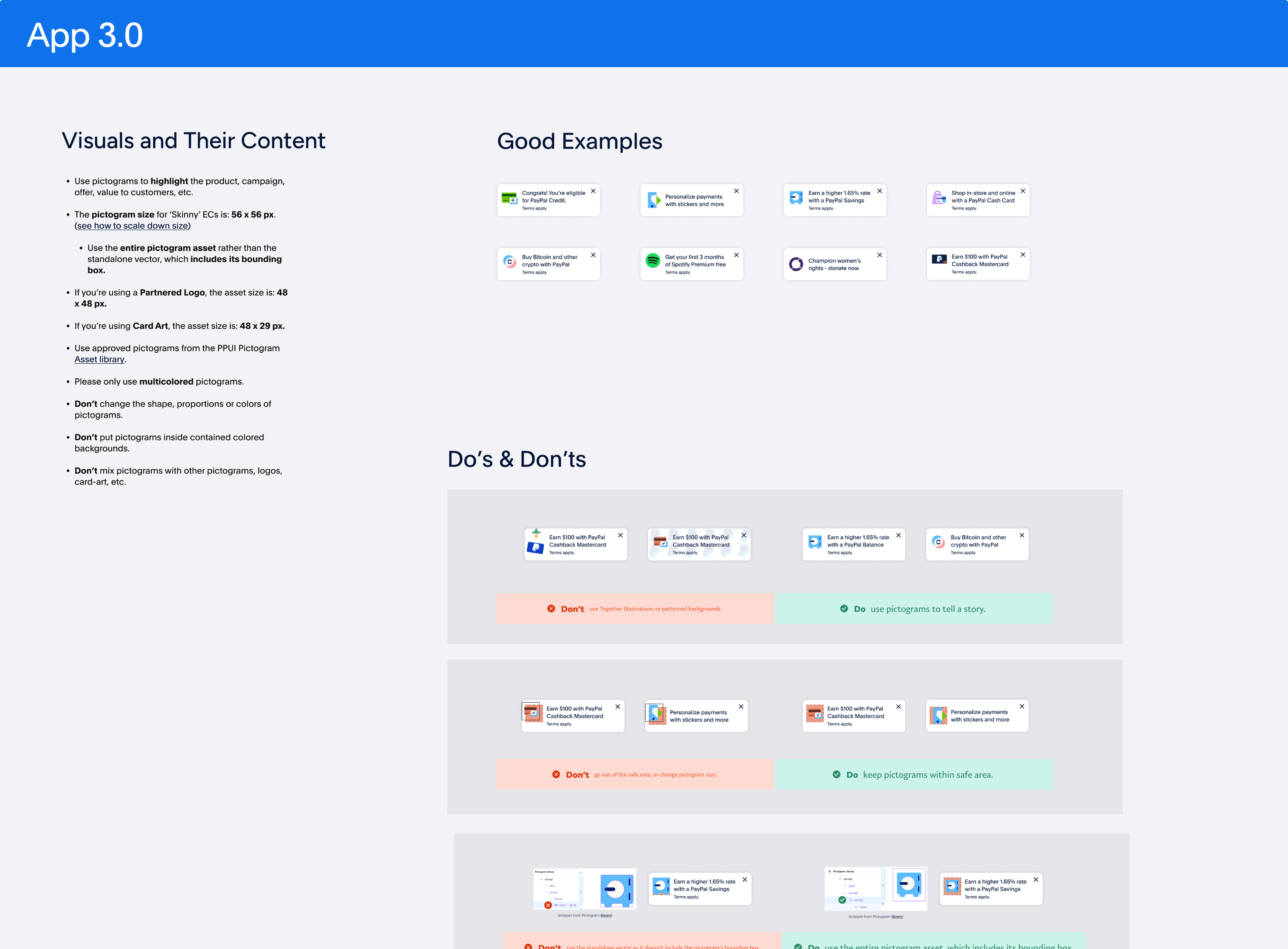
The visual system was designed to support that focus. Cards default to a clean, white, airy structure with a single supporting pictogram pulled from PayPal's pictogram library, adding just enough color and personality to stand out from the surrounding UI without pulling focus from the message.
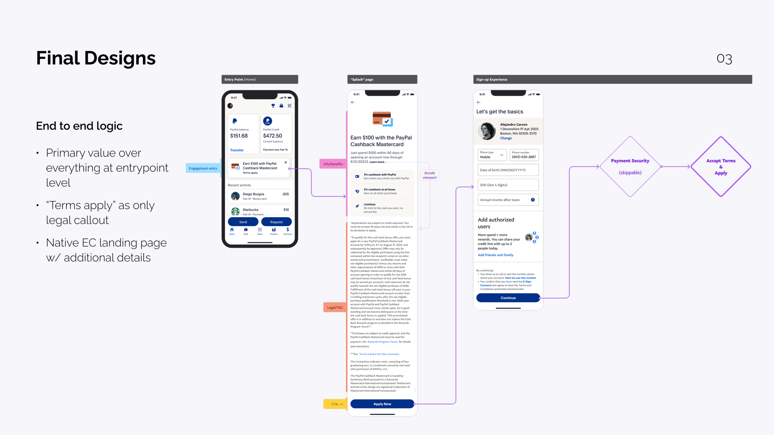
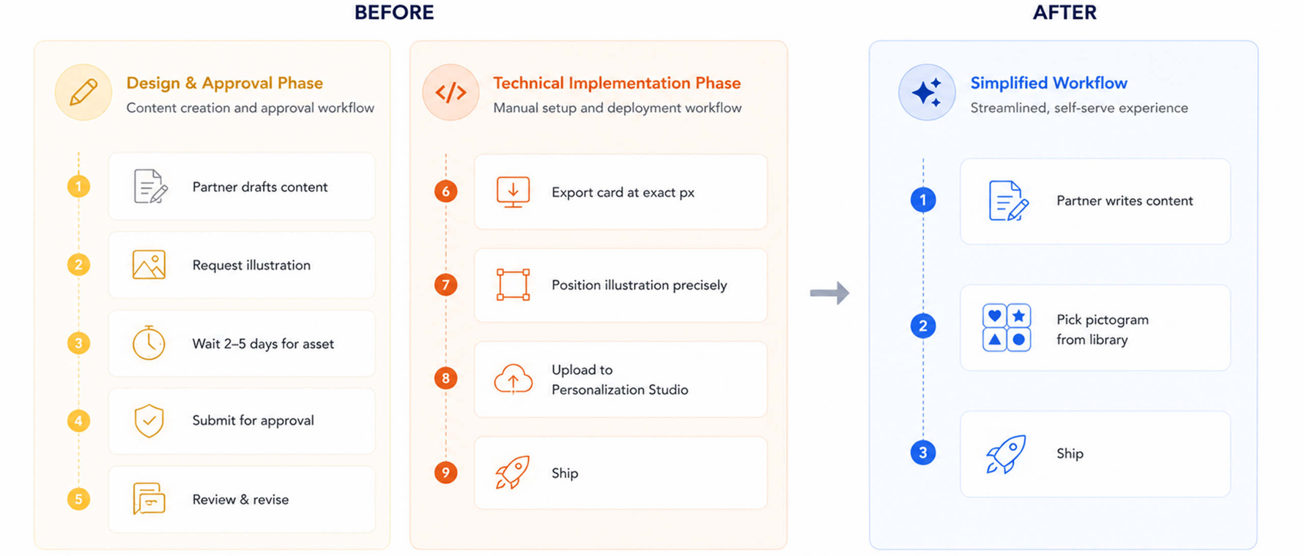
A Simpler Path to Ship
Before the redesign, shipping a card meant making a long chain of decisions: header, subheader, CTA, color treatment, illustration choice, and often a custom illustration request that required submitting a ticket and waiting for the PayPal Design Systems team to create a bespoke "Together Illustration" asset.
Once approved, the friction didn't stop. Teams then had to manually export assets for Personalization Studio with exact pixel dimensions — no rounded corners, precise positioning for illustrations — because the content would render on top of the card later. This technical constraint created constant back-and-forth and do-overs when dimensions were even slightly off.
The new system collapses most of those decisions. Color is white by default. The card itself acts as the CTA. Illustration becomes a single pictogram chosen from an existing library. The only thing partners need to bring is their content, which is exactly where their effort should go.
Scaling the System
Enabling Self-Serve
A core goal of the redesign was reducing the design and approval overhead that had been slowing teams down. With clear card categories, content rules, and a tightly scoped visual system, teams could build and launch cards without routing every variation through design review.
I worked with cross-functional partners to document the system, define when each card type should be used, and clarify what fell inside the guardrails versus what required design input. The result was a workflow where most cards shipped through a self-serve path, with design involvement reserved for new patterns or edge cases.
Reducing Approval Dependency
By moving from custom one-off cards to a structured system, the approval process tightened significantly. Teams no longer needed full design and legal review for standard cards, since the system itself enforced the rules that previously had to be checked manually. That cut approval dependency by roughly 90% and freed design capacity for higher-leverage work.
Impact
Business Outcomes
The Engagement Card system became one of the highest-leverage surfaces on the PayPal app, contributing over $200M in customer lifetime value by giving teams a consistent way to drive product adoption, partner promotions, and user education at scale.
Speed and Efficiency
Time to launch dropped by 2 to 3x, with teams shipping cards in a fraction of the time it used to take. Approval dependency dropped by roughly 90%, as the system's built-in guardrails replaced the manual review process that had been slowing teams down.
User Engagement
Click-through rates improved by 18% across redesigned cards, driven by clearer hierarchy, reduced visual noise, and more focused content. Cards that previously suffered from banner blindness started performing as intentional, scannable surfaces in the feed.
Reflections
What I Took Away
The biggest lesson from this project was that scalability is a content and governance problem as much as a design problem. The visual work mattered, but the cards only became reliable once content rules, legal language, and the approval workflow were rebuilt alongside the design. Stripping the visual system back also raised the bar for content, which turned out to be exactly the right trade-off: a sharper message in a quieter frame consistently outperformed a busier card.
Working against a moving design system also pushed me to make decisions with incomplete information, which became one of the more useful skills I sharpened. Waiting for perfect inputs wasn't an option, so I learned to design in a way that could adapt as the system around me solidified.
What I'd Do Differently
If I were starting over, I'd invest in the governance model earlier. A lot of the friction came from teams operating without clear guardrails for too long, and getting that documentation in place sooner would have shortened the path to a self-serve workflow.

Interested in working together?
Designed and built by Alejandro Garzon. © 2026 All rights reserved.